Friday, September 12, 2014
Chet Faker | Gold
Thought Beats: Smooth and minimal. Electric guitars are faded and the piano acts as the main beat. There are drums, but not many.
Visuals to song: The song matches well with the music video due to the fact that the faded music blends in well with the eerie road and the dancers coming out of the darkness - similar to how Chet's voice emerges out of the slow, rhythmic electro.
Technical Aspects: Like many of Murai's video, there is only one tracking shot. Near the end, it pans to Chet Faker would seems to have been in a car accident - then cuts to the backs of the rollerskaters, as we are now following them. This would have been accomplished in the editing process.
Star Image: Chet Faker appears in the music video only at the end. He is lip syncing, but no looking directly at the audience. The roller skaters, however, do.
Narrative & Performance: The narrative is vague and abstract. It seems to just be a sequence of events hat could refer to the song's lyrics, "you got to know, I'm feeling good"--with him expressing his love for one of the roller skaters that he's watching: "you could be the one for me."
Portrayal of women: The three roller skaters are serpentine and seductive. They are wearing very little clothes, whereas the man is in full dress and covered by the car; he also has a beard, if that's relevant to instilling gender stereotypes.
I really like the simplicity of this video, and it gave me ideas for costumes and colour schemes: Black and yellow.

Die Antwoord | I Fink U Freeky
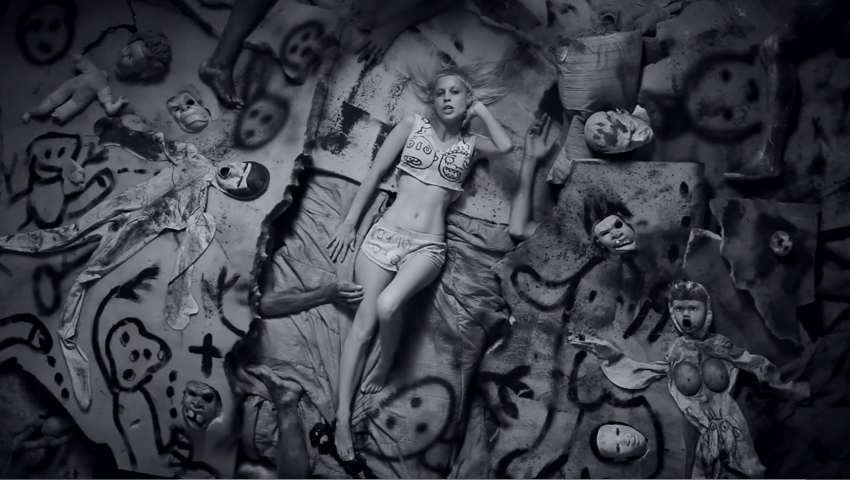
Die Antwoord have been a major influence in my decision to add actors as well as puppets. Each screencapture of this music video could be an installation in a photography exhibition. The still camerawork and energetic goings on in each of the clips compliment the repetitive techno.
Thought beats: The music has a child-like repetition and is very repetitive, making it catchy but also unnerving; different.
Narrative and performance: There is minimal narrative. The only thing that is continuous in the music video is that the couple are together, in different scenarios; there may or may not be a love story. Everything is left to the viewer to interpret.
Star Image: Both singers are featured in different contexts throughout the video. There is the theory of looking with both the singer, which continuously try to stare at the audience, as though they are confronting them.
Relations of visuals to song: The visuals to the song are completely abstract and have no clear connection to one another, say for the song title: 'Freeky'. Every screencap is catered to unnerve and intrigue the audience.
Technical aspects of video: The whole project is filmed in monochrome. A lot of attention has been put into the mise en scene: Each set has been designed by Ninja, who is in fact an art graduate. Cardboard, felt tips, snakes, rats and blow up dolls have been used to really plant itself into the subconscious of the listening. The costumes are simple, and the make up is mostly dirt and war-paint.
Thought beats: The music has a child-like repetition and is very repetitive, making it catchy but also unnerving; different.
Narrative and performance: There is minimal narrative. The only thing that is continuous in the music video is that the couple are together, in different scenarios; there may or may not be a love story. Everything is left to the viewer to interpret.
Star Image: Both singers are featured in different contexts throughout the video. There is the theory of looking with both the singer, which continuously try to stare at the audience, as though they are confronting them.
Relations of visuals to song: The visuals to the song are completely abstract and have no clear connection to one another, say for the song title: 'Freeky'. Every screencap is catered to unnerve and intrigue the audience.
Technical aspects of video: The whole project is filmed in monochrome. A lot of attention has been put into the mise en scene: Each set has been designed by Ninja, who is in fact an art graduate. Cardboard, felt tips, snakes, rats and blow up dolls have been used to really plant itself into the subconscious of the listening. The costumes are simple, and the make up is mostly dirt and war-paint.
 |
| In my music video, I'll be nicking the idea of using white facepaint. |
 |
| Additionally, I have lots more idea for designing sets--most of them involve cardboard and spray paint. |
 |
| I really like this deep shot because it creates a sense of voyeurism, double with the fact that each artist is staring at the camera. You don't feel part of their world like in other videos. You become very aware that you're just watching people make pretty sounds. |
Thursday, September 11, 2014
Performers
Although I have decided to use puppets in my music video, it would also be wise to stick to conventions by filming real human beings (either a band, dancers or people lip syncing) who can perform in the song.
To advertise, I have posted a poster on facebook:
 And have then printed out ten so that I can distribute them around the drama department in Ashfield post 16.
To advertise, I have posted a poster on facebook:
Websites
In order to design a website for our own fake bands, it was imperative for us to research sites who are part of our chosen genre. This means that we can better understand the conventions of a band website, what we should include in our own and how to make it look as real and as professional as possibly: how else are we going to sell our album digipaks?
Unknown song: Lyrics
NOTE: the following lyrics have been vaguely deciphered from listening to the song over and over again
I can see even with eyes closed the world despises
What is just a depiction, a vision of a modern design
Getting up while the getting is good
Think of me high wire
If you see me, watch your TV baby
You know I’m on
Your backbone ain’t broke
But don’t you be eyeing a professional
Wanna live, want destroy you’ve got to try
I can see even with eyes closed the world despises
What is just a depiction, a vision of a modern design
Getting up while the getting is good
Think of me high wire
If you see me, watch your TV baby
You know I’m on
Your backbone ain’t broke
But don’t you be eyeing a professional
Wanna live, want destroy you’ve got to try
Do what you wanna do
See what you wanna see
Go where you wanna go
Be who you wanna be
Be who you gotta be
We need a major feat
Burn it down
Burn it down
See what you wanna see
Go where you wanna go
Be who you wanna be
Be who you gotta be
We need a major feat
Burn it down
Burn it down
You can see your eyes are closed
To shy from the sun
As bad as when the vision that you envision was undermined
Got out when the getting was good
You never fought if to think
Wanna live, once tried, you’ve got to try
To shy from the sun
As bad as when the vision that you envision was undermined
Got out when the getting was good
You never fought if to think
Wanna live, once tried, you’ve got to try
Do what you wanna do
See what you wanna see
Go where you wanna go
Be who you wanna be
Be who you gotta be
We need a major feat, baby
Burn it down
See what you wanna see
Go where you wanna go
Be who you wanna be
Be who you gotta be
We need a major feat, baby
Burn it down
I’m just talking shit
I’ll just mess it up
I just tune it out
I’ll just mess it up
I just tune it out
There goes the day
Another I have wasted
Nothing to do, nowhere to go, nothing to say
I just sing, I don’t know
Oh-oh-oh
I don’t know
Oh-oh-oh, oh, oh, Oh-oh
Another I have wasted
Nothing to do, nowhere to go, nothing to say
I just sing, I don’t know
Oh-oh-oh
I don’t know
Oh-oh-oh, oh, oh, Oh-oh
Go
Do what you wanna do
See what you wanna see
Go where you wanna go uh uh
Be who you wanna be
Be who you gotta be
We need a major feat, baby
Burn it down
Burn it down
See what you wanna see
Go where you wanna go uh uh
Be who you wanna be
Be who you gotta be
We need a major feat, baby
Burn it down
Burn it down
Wednesday, September 10, 2014
Lighting
 |
| Only God Forgives (2013) Larry Smith, Cinematographer |
One of the most important parts of film-making is cinematography--moreover, colouring and lighting. My favourite director, Nicolas Winding Refn, creates an atmosphere and general aesthetic in his work with solely the use of lighting and minimal dialog to create a psychedelic, Kubrick-esque experience for the viewer that intrigues then into watching as opposed to bombarding them with too heavy a storyline or dialog (much like Tarantino).
Different tone and textures picked out by harsh lights or deep shadows can define a music video befor the viewer even listens to the song. Additionally, something that I failed to anticipate whilst filming last year was grainy film--a result of poorly-planned lighting choices.
Different tone and textures picked out by harsh lights or deep shadows can define a music video befor the viewer even listens to the song. Additionally, something that I failed to anticipate whilst filming last year was grainy film--a result of poorly-planned lighting choices.
Therefore when the green light had been given for my current media teacher to invest in new equipment - such as lighting - I thought that it would be best to experiment even beginning to film my music video.
The following lighting tests were achieved with a Rotolight borrowed from the Media department, and taking photographs on my phone of fabric blossoms in different lighting.
 |
| Shot indoors; natural light from the window. White background. |
 |
| Due to the fact that I did not have a red light, I simply closed my red curtains, which created a low--budget red light due to the fact that the sun was leaking through the window. |
 |
| First of all, I experimented with the lights before using the colour filters. Propping the pillow up against a pillow on the lft hand side of the bedside table, the low level of the lighting meant that certain shapes were picked up in the flower, whereas the right hand side remained unlit--creating a dramatic effect. |
 |
| Shining the torch from above created a blue tinge due to the fact that the white light contrasted with the red background, achieving the Refn look and also acting as soft light that could be mistaken for a bright streetlight. |
 |
| Using a white light, I've noticed, make the red background more pink ((or my blackberry camera is bad at picking up colours) - this lighting set up had a similar effect to the low side light above, except for the right side of the flowers were now lit. |
 |
| Using a bright pink light cause the flowers to blend into their already warm surroundings. There was minimal light, and shadow became the only way of distinguishing shape on non-reflective surfaces. |
 |
| Medium amber created a sickly contract and even caused my phone to pick up some green tones. It completely changed the range of colours into something warmer and more natural than what appears to be pink and blue neon. |
 |
| THis was achieved by used the white, film-like colour ring over the rotolight, which softened the image and less light and contrast was picked up between the lights and shadows. |
 |
| This final lighting test was with two of the rotolight. Due to the fact that the main light is brighter than the other, I used the blue film cover due to the fact that red was already the background cover. The light on the right was pink; it was an effective way of replicating an eery, neon location on a minimal budget. |
Subscribe to:
Posts (Atom)