Tuesday, September 30, 2014
Sunday, September 28, 2014
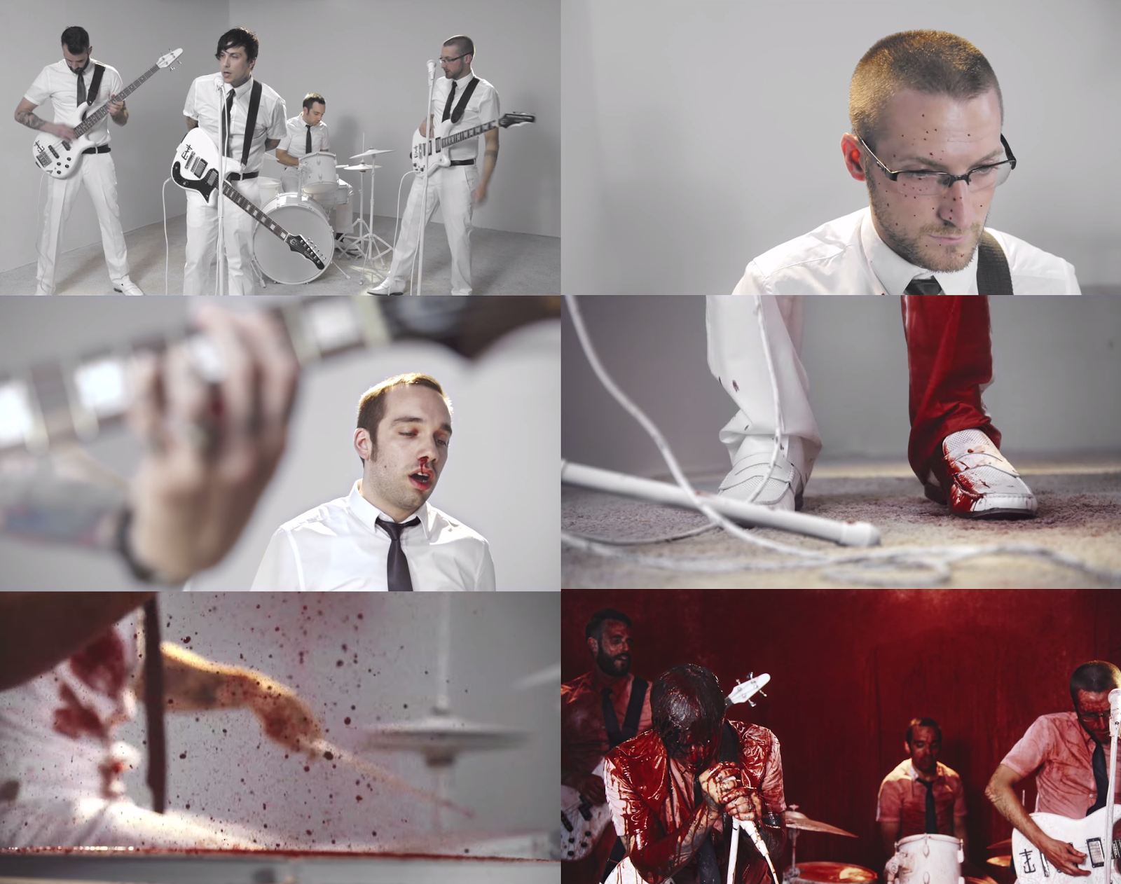
joyriding | frnkiero andthe cellabration
In Frnkiero andthe cellabration's debut music video, the band are seen playing in a bleach white room in black ties and white trousers and shirt, playing pristine instruments. As the song continues, blood splatters on the lead guitars, and little by little it's as if the band are deteriorating as they begin to bleen out from parts of their bodies; onto their instruments. The walls get covered with blood and in the end, they are left in a red room, dripping with red dye.
I like the how a simple thing like the manipulation of colours and buckets of blood can make for an interesting music video, and I would now like to experiment with paint somewhere in my final piece...be it splattering some poor unfortunate soul or for simple effects.
Filming Date
The date for filming the human band in the school's photography studio has been changed from Friday the 26th of September to Monday the 29th due to the fact that I couldn't get a camera from the media department.

However this gave me more time to plan for the music video. For example, I've had time to talk with my actors; to ask them to look for white shirts and black ties so that group have simple but organised costumes.
David Bowie | The Next Day

Genre: Art Rock
Colour Scheme: Black and white
Visuals: The front cover is of David back, black and white, in a back background. His face is covered by a large square, as is seen in other panels of the digipak. The back of the CD's credits are cut off by the square motif, and track information is overlayed over that. Inner features include a fold-out poster which is red, yellow and blue and is a blown up version of the front image on the Album. On the back of this is a blue and yellow sheet with a list of acknowledgements and lyrics for his songs. I really like the minimalism and simplicity of the design (even is the album was a total train wreck, music-wise).
Writing: Clean and slim. On the back and inner pages, the font is extremely small, which gives the illusion of space and sparceness.
Gorillaz | Demon Days

Genre: Alternative Rock
Colour Scheme: Cartoon, Lineart
Visuals: On the front cover are side profiles of the band, and they appear to be having their mug shot taken. The four squares look like panels in a comic book, or window panes. Despite the virtual band being cartoons, there is a grungey, worn-out overlay.
On the back of the album, the band are seen in a deep shot, and there is no background. Song information and credits can be found at the side and the bottom, as well as a website link for fan to look at. From this album cover, I have decided to take the idea of the web address.
Writing: Clean, black and white. The font appears to be Arial or something equally as slim with no embellishments.
Misfits | Collection

Genre: Punk
Colour Scheme: Monochrome
Visuals: A man dressed in a skeleton costume (wearing a facemask which is the logo for the back), with rockabilly hair-do. The stripey costume is simple and could also be compared to Kasabian's outfits in the Eez-Eh music video. I like the black colours of this CD design and the DIY/Hammerhouse feeling of it, which correlates with the band's style, genre and music.
Writing: Minimal, with 'spooky' font you expect to see on a B movie horror poster.
Puppet Sets

The benefit of this is that I have plenty of flexibility with where I can film and what I can alter.


First of all, I [carefully] propped the lights against the picture rail, which would act as overhead lighting. I did not like this due to the fact that the picture picked up on my phone was too dark and grainy.
Additionally, I used a puppet to see how the light would make it look, and the effect gained was similar to just switching on the light: The blue and green looks washed out and less interesting.


Subscribe to:
Posts (Atom)