Tuesday, September 30, 2014
Sunday, September 28, 2014
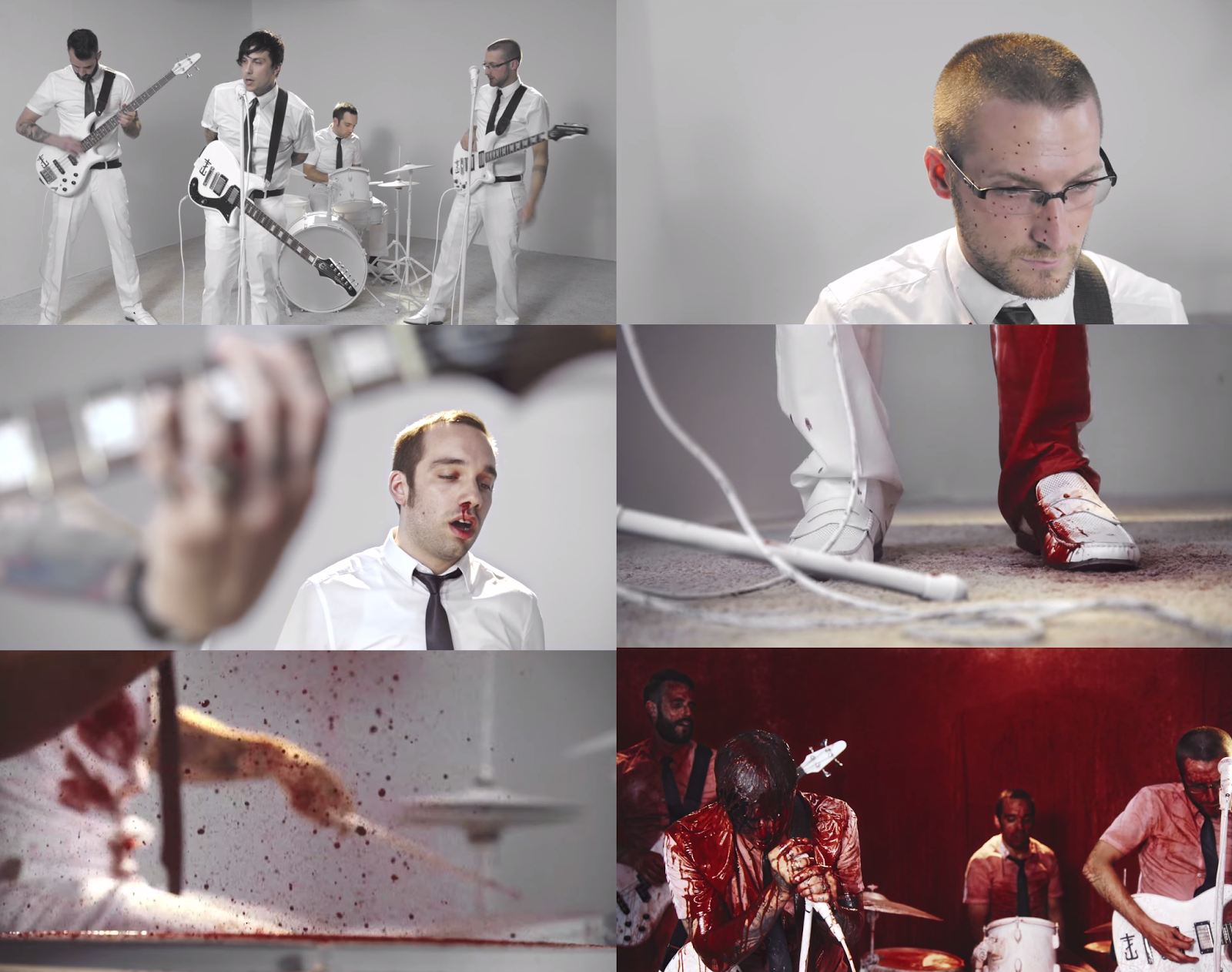
joyriding | frnkiero andthe cellabration
In Frnkiero andthe cellabration's debut music video, the band are seen playing in a bleach white room in black ties and white trousers and shirt, playing pristine instruments. As the song continues, blood splatters on the lead guitars, and little by little it's as if the band are deteriorating as they begin to bleen out from parts of their bodies; onto their instruments. The walls get covered with blood and in the end, they are left in a red room, dripping with red dye.
I like the how a simple thing like the manipulation of colours and buckets of blood can make for an interesting music video, and I would now like to experiment with paint somewhere in my final piece...be it splattering some poor unfortunate soul or for simple effects.
Filming Date
The date for filming the human band in the school's photography studio has been changed from Friday the 26th of September to Monday the 29th due to the fact that I couldn't get a camera from the media department.

However this gave me more time to plan for the music video. For example, I've had time to talk with my actors; to ask them to look for white shirts and black ties so that group have simple but organised costumes.
David Bowie | The Next Day

Genre: Art Rock
Colour Scheme: Black and white
Visuals: The front cover is of David back, black and white, in a back background. His face is covered by a large square, as is seen in other panels of the digipak. The back of the CD's credits are cut off by the square motif, and track information is overlayed over that. Inner features include a fold-out poster which is red, yellow and blue and is a blown up version of the front image on the Album. On the back of this is a blue and yellow sheet with a list of acknowledgements and lyrics for his songs. I really like the minimalism and simplicity of the design (even is the album was a total train wreck, music-wise).
Writing: Clean and slim. On the back and inner pages, the font is extremely small, which gives the illusion of space and sparceness.
Gorillaz | Demon Days

Genre: Alternative Rock
Colour Scheme: Cartoon, Lineart
Visuals: On the front cover are side profiles of the band, and they appear to be having their mug shot taken. The four squares look like panels in a comic book, or window panes. Despite the virtual band being cartoons, there is a grungey, worn-out overlay.
On the back of the album, the band are seen in a deep shot, and there is no background. Song information and credits can be found at the side and the bottom, as well as a website link for fan to look at. From this album cover, I have decided to take the idea of the web address.
Writing: Clean, black and white. The font appears to be Arial or something equally as slim with no embellishments.
Misfits | Collection

Genre: Punk
Colour Scheme: Monochrome
Visuals: A man dressed in a skeleton costume (wearing a facemask which is the logo for the back), with rockabilly hair-do. The stripey costume is simple and could also be compared to Kasabian's outfits in the Eez-Eh music video. I like the black colours of this CD design and the DIY/Hammerhouse feeling of it, which correlates with the band's style, genre and music.
Writing: Minimal, with 'spooky' font you expect to see on a B movie horror poster.
Puppet Sets

The benefit of this is that I have plenty of flexibility with where I can film and what I can alter.


First of all, I [carefully] propped the lights against the picture rail, which would act as overhead lighting. I did not like this due to the fact that the picture picked up on my phone was too dark and grainy.
Additionally, I used a puppet to see how the light would make it look, and the effect gained was similar to just switching on the light: The blue and green looks washed out and less interesting.


Friday, September 26, 2014
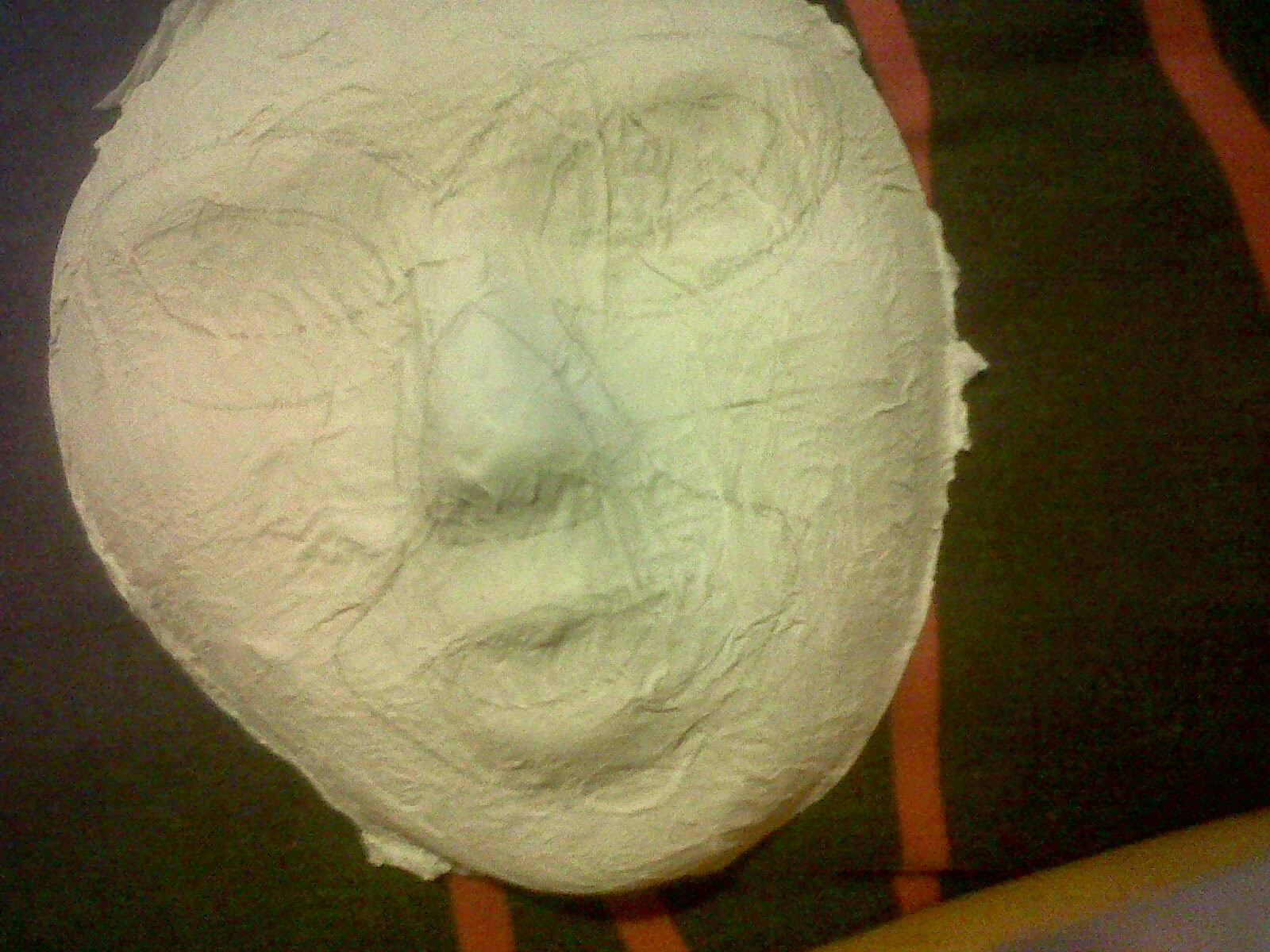
Band Masks


To begin with, I mixed a solution of PVA glue and water into a bowl and found the largest brush that I could. I then went onto dabbing the mask in the water/glue solution in order to make a base for things to stick against it.
I then went onto tearing up toilet tissue (unused) into stips and went onto dabbing the strip in vertically over the mask; into all the contours, but making sure that the mouth, nose and eye holes are covered for the sake of aesthetics.


Tuesday, September 23, 2014
Meet the Band

Additionally, actual human band members have materialised thanks to my advertisements and loud shouts throughout the atrium for volunteers who wish too star in a music video.


MTV Cribs
I cannot apologise enough for the lagging sound and fast camera. That is mine and my laptop camera's fault entirely.
Milk
Dirty thoughts aside, I saw this the other day and thought that it was a very interesting edit. I loved how at the beginning, the drips of milk flew upwards from Zachary Quinto (like the drips from the eggs in Alien), and then, once the clip was done, it was then played the other way round to show the actor getting the drink thrown all over him. I also like the white against the black background and the simple lighting, and may steal this for a sort of beginning and end to my music video. However to avoid having my music video's protagonist looking like he's performing a money shot in a cheap porno, it will be different colours paints (similar to Flobots' Circle in the Square with the paint powder).
Na Na Na | My Chemical Romance
Thought Beats: Loud, quick and lo-fi, much like my own song. It includes pop-punk elements as well as classic punk and classic rock. The song is shouted rather than sung, and sound how every ten year old boy dreams to sound whilst flicking his way through pop-art comic books and sipping on cherry slurpees. It's vibrant, energetic and has amusing lyrics.


The visuals are all in key wit the lyrics, especially when the lyrics are shown underneath of images of fast food when Gerard Way chants "Let's blow an artery" and a flashing skull coming towards the camera when "no one wants to die is called out".
There is no narrative or performance: Only images that help punctuate the lyrics to the song and overall feel of the the Killjoy album, which is comic heroes, wastelands, evil corporation and colour outlaws.
Technical Specs: Very little technical specs have been used apart from care and attention too whilst photographing and overlapping various images that appear onscreen such as a party mask and a mannequin's hands that are slowly painted in rainbow colours in a stop-motion style animation. The beats, however, tie in with how the song is cut. For example in the beginning, the 'Na Na Na's' change colour as they're sung.
During the lyrics "Fuck like a Kennedy", a woman's shapely legs are seen poking out of an American flag, as though she's about to step out of the sheet and probably be nude underneath. This literally objectifies women in the midst of the different images and objects.
Can't Stop | Red Hot Chili Peppers
Thought Beats: The music begins with a steady guitar chord, strummed continuously before drumbeats intercept to quicken the pace. This then cuts off to another guitar playing out a beat as opposed to drums, which eventually catch up with the music when the singing begins to rap. The chorus is melodic and comparable to desert rock, as research with Fu Manchu. The song reminds me of a less chaotic and higher fidelity variant of my chosen song, with added elements of funk and pop.
The stars are seen performing in a white, warehouse-like space as a band against an orange background. However, there are odd scenes of the band members experimenting with different objects (in a similar fashion to Kasabian in "Eez-Eh".) There is a lot of heavy focus on the main singer, who is often seen singing to the audience/camera - strengthening the theory involving the act of looking.
In the style of Erwin Wurm, the band have been given different objects and are then told to interact with them in any way they desire. Although there is no clear link between the visuals to the song at first, Wurm's works are thought provoking and force us to taken a different look at everyday objects; to see them instead as pieces of art. Therefore, there is a correlation with the visuals of the song "this life is more than ordinary" as well as other disjointed phrases quickly overlap one another, similar to how fleeting Wurm's one minute pieces are. "Can't stop" as a title is a pretty accurate two-word description of his artwork as well as this song's tempo and memorability.
There is no narrative, but a lot of different performances are featured. There is the standard band layout as well as a scene with the guitarist singing in dustbins, playing his guitar under a waterfall of petals, and then performing in a dark room full of flashing lamps. The music video is completely lateral (in the style of the director who is pretty much the father of the music video industry: Mark Romanek).
There is a part of the music video where the camera travels up a tube towards the lead singer's face: possibly achieve by rewinding the footage of a camera falling down a tube in the editing process. Apart from that, the quick cuts are really all that add pace to the music video. There is very little movement of the camera, except for the scene at the beginning with the band running down a hallways with radiators strapped to their backs.
I really enjoy the simplicity of this music video, and have decided to film in an indoor space, be it a professional studio or a garden shed, and see what I can do to create single colour sets. After that, I will not focus too hard on the band's performance, and instead have them interact with their environment, singing to the audience whilst doing odd things. This subversive take on the Punk genre is really what the music is all about: Rebelling against what is known.
Kasabian | Eez-Eh
Thought Beats: The music is fast paced and upbeat with an electro beat. The band's singing is repetitive and they sing in a rough, British accent. It has the feel of a video game soundtrack, or something you'd listen to whilst jogging or in a club: energetic.
The stars are seen in various situations with different backgrounds and objects, mostly singing into the camera - both low, high and mid angles. There are very few close ups, and the band members seen to be homogenised with one another and their surroundings. It is, however, very performance-orientated and the story line is not clear: something that I'd like to incorporate in my own music video.
There is no clear link with the visuals to the song, unless you count the part of the song where the lyrics proclaim "turning my milk sour", and one of the performers spit out a bottle of milk. Noomi Rapace is occasionally seen actually playing the instruments and 'howling' in key with the music; the band members also lip sync.
The narrative is abstract and the performance is focused on the band's 'acting' as opposed to having them playing instruments. They're seen jumping, dancing and interacting with objects such as joke-shop glasses, toy guns and monkey statues.
The lighting is soft and saturated. The whole of the warehouse is probably lit from high above, and additional sit lighting and reflectors have dimmer the impact: Rembrandt lighting + Butterfly lighting due to nose shadow.
The Technical Aspects of the music video are simple yet affective. The quick cuts make up for a lack of camera movement and gives the piece a professional feel despite how little has been used to achieve the piece. There is a part of the music video where Noomi Rapace puts on a wig backwards, and one of the bands are rotating. Using desaturation and a colour mask, the pink backgrounds on which the band perform are the only colour sources in the video. Very little attention has been paid to mise en scene: the set is literally blank sets in a warehouse, possibly used for professional photoshoots. Their outfits are black and white - or at least, they appear black and white. I like the simple contrast of one of the performer's striped T Shirts and glove, in the style of a skeleton. As well as the back and white + one colour technique I will be nicking the costume ideas for my own music video. Also, obscure objects and props that the band use during the music video is an interesting idea, (as seen in Red Hot Chili Pepper's 'Can't Stop').
The portrayal of women is done in a very different manner as opposed to most videos of the pop genre. Noomi Rapace (Actress) feature in a none sexual manner; fully dressed and featuring as the 'muse' of the music video rather than a sex object to be draped over the band.
Saturday, September 20, 2014
Making Puppets
A lot of how my final puppet turned out was improvised, by for getting things like templates and sewing tips, I consulted this video. Before watching this video, I knew that I wanted a Jim Henson-type puppet, but achieving that seemed a mystery; all the tutorials I'd watched prior were for either string puppets or complicated monstrosities that require levers and pullies.


Perhaps he needs arms...and clothes.
Food for thought.
Band Image
As is common with quite a lot of (Pop) Punk bands - and to be fair, quite a few other bands in various genres - they are given a gimmick or a style that they are known for.
A famous example of exploiting the band's star image comes from My Chemical Romance, who, with every different album, used to come up with a
different 'Look'.
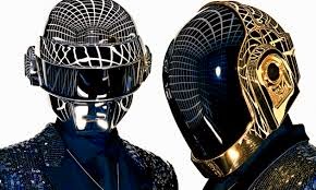
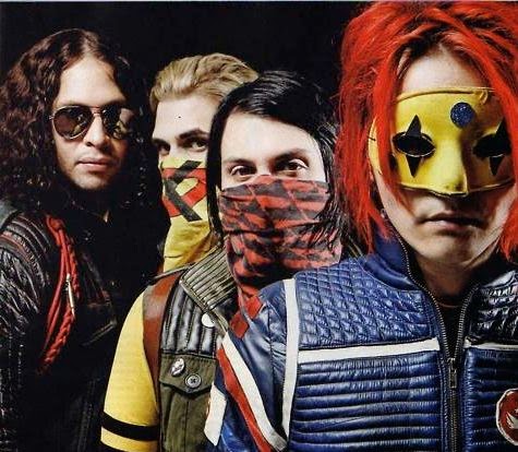
 Bands such as Daft Punk and Slipknot have a more prolonged image than My Chemical; their masks and unique sounds cement them in the minds of their listeners and they are not the easiest to forget: Given that one band are supposedly robots, and the other look like something from Marilyn Manson's night terrors. Needless to say, this has given me a lot of ideas about band "Macro Friends", and the more "artistic" direction that I will send them down.
A famous example of exploiting the band's star image comes from My Chemical Romance, who, with every different album, used to come up with a
different 'Look'.
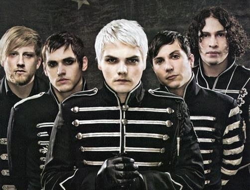 |
| In their Black Parade album, the band were frequently seen on tour wearing black and white military uniforms, heavy eye liner - and the lead singer dyed his hair white, whereas most of the others kept with their dyed hairdos. |
 |
| In the Killjoy album, the bnad changed their look once more into that of pop-art-americana-superheores, who donned face masks and scarves - and created a world which seemed to be a cross between Mad Max and Guardians of the Galaxy. They has names such as "Cobra Kid" and "Party Poison" - and generally took a step away from the previous monochrome look. Yet again, most of the band members have re-dyed their hair into something a little more modern. |
Bands such as Daft Punk and Slipknot have a more prolonged image than My Chemical; their masks and unique sounds cement them in the minds of their listeners and they are not the easiest to forget: Given that one band are supposedly robots, and the other look like something from Marilyn Manson's night terrors. Needless to say, this has given me a lot of ideas about band "Macro Friends", and the more "artistic" direction that I will send them down.audience ( + Online Research )
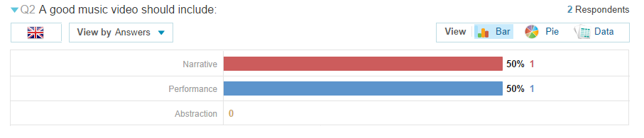
In order to investigate my potential audience, I formulated a survey on the with the help of Toluna Quick Surveys in order to quickly gather intel on what my music video should include:
 Powered by
UPDATE: the results for my survey were quite minimal (two people answered the questions after a week), but hey. It's something to refer to:


Additionally, I used youtube in order to research into popular punk music videos.
 Playlists had been made by Kerrang viewers/readers of the 50 most definitive pop-punk classic; although there is no guarantee that ccs316 has copied this playlist from a website/programme showing by Kerrang!, it was useful, nonetheless, for gathering ideas for my music video.
A lot of these music videos included band members, either performing or being focused on as the protagonists. This probably comes from the 'Pop' Punk genre's need to sell the band and their image.
 Powered by
 UPDATE: the results for my survey were quite minimal (two people answered the questions after a week), but hey. It's something to refer to:
Obviously, one of the answers was complete jargon (which may demonstrate their passion for their genre, to an extent that words escape them), but the other answer is much more constructive. I will look into Tenacious D's music videos and analyse them for ideas.
50% of the participants preferred Narrative, whereas 50% of them liked Performance. Its pretty obviously what I'll need to include.
About 7/10 say yes to intertextuality: It may be worthwhile to look into replicating a scene from a movie or to add lines from something like the muppets or sesame street.
Almost 100% of the poll agreed to Physical SFX trumping CGI (which is pretty great because I wouldn't know where to start with visual effects editing software).
(This is an interview I managed to salvage in a Rock City gig line for a Black Veil Brides concert. Unfortunately, the video file was corrupted and most of the interviews have been lost More interviews will have to be conducted.)
Additionally, I used youtube in order to research into popular punk music videos.
A lot of these music videos included band members, either performing or being focused on as the protagonists. This probably comes from the 'Pop' Punk genre's need to sell the band and their image.
Thursday, September 18, 2014
Deathbound | Mastadon
Thought beats: Aggressive. Lots of low fidelity and static-ish instruments. Heavy guitars and frantic drumbeats. The very sound of the song makes one think of destruction.
Narrative and Performance: The lead singer is only seen once at the beginning of the music video, to inform the audience about how lunar eclipses and cause some people go act out.
Technical Aspects: Heavily focused on mise en scene and additional graphics such as explosions. Quick cuts and funny puppets.
Visuals to song: The heavy metal music plays in unison with the destruction of 'rainbow land'.
Star Image: The lead singer of Mastodon is seen at the beginning of the music video as a narrator. There is intertextuality in reference to a popular American TV show for kids.
Monday, September 15, 2014

bat for lashes | lilies
Thought Beats: The acoustics are dream-like, minimalist.
Visuals to Song: The visuals do not match the song. There are puppets and stop motion backgrounds, despite how serious the song is.
Star Image: Lead singer visible whilst singing, not always looking towards the audience. She is interacting with her environment.
Technical Aspects: Stop motion backgrounds. Lots of attention on the mise en scene: large animal costumes, tiny sets and low key lighting. Smoke machines and interesting colours. The background is dark, black and plain.
Narrative and Performance: There are parts of a narrative involving a girl singing and who then attracts 'monsters'. That's as far as the story develops; the rest is abstract, partly dancing and partly miniature sets which have been painstakingly designed.
Portrayal of women: She is dressed in a bikini, but is not shown to be a sex object. Her movements are expressive and in lieu with the music rather than having her in a bikini just to appeal to an audience who have the "male gaze", wherein women are either sex objects or old.
Flight of the Conchords
Flight of the Conchords is a New Zealand-based comedy band composed of Bret McKenzie and Jemaine Clement. Their genre spans from electro, rap, hip hop, indie and surrealism: comparable to Might Boosh.
What drew me to this band was their TV show, and obviously the humour they add to their dream sequences, skits and music videos: All accomplished on a measly budget (like mine) but entertaining nonetheless. I will be drawing a lot of influence from this band's ridiculous music videos.
I enjoy the cutting of this part of the music video when the close up shot of the singer and the dancers transforms into a mid shot - and then the band do an odd, tribal dance.
Thought beats: The lyrics are literal, and has the audience picturing all that's been sung about due to the hyper literate style of delivery.
Star Image: The duo are frequently seen in the music video, sometimes staring out at the audience.
Technical Aspects: A lot of green screen work has been put into the music video. Additionally, graphics.
Narrative & Performance: The band are doing a homage to the Black Eyed Peas; they both perform and are looking right at the audience whilst doing stupid dances or swept up in a graphic backgrounds.
Thought beats: Again, there lyrics are very literal, although the music in this video is similar to "The petshop boys". A synthesizer has been used to add a futuristic edge to the music, or at least to make it clinical and modern.
Visuals to song: The visuals consist of the band walking through the streets of New York, pawn shops, their apartment and playing a keyboard. it's simple and more or less links with the narrative of the song.
Star Image: Yet again, the duo are frequently seen in the music video, sometimes staring out at the audience.
Technical Aspects: There is a transition effect used on Jemaine which makes him blend into the background: Quite an obvious metaphor for inner city life.
Narrative & Performance: Does as is said. Effective and simple, but nearly impossible for me to replicate when I can barely understand the lyrics of my chosen song.
Friday, September 12, 2014
figure it out | royal blood
Royal Blood - Figure it Out from Finish on Vimeo.
Thought Beats: Rock guitars and drums. A hoarse male voice. The song seems very masculine and wouldn't be amiss in a dive bar. It has a grungy quality that is similar to my own track.
Visuals to song: The title and chorus 'Figure it out' works well with the subject. Also, the heavy guitars and chorus start only after the girl runs. When the man and woman embrace, the tempo slows - up until the point when we realise that she has stabbed him.
Star Image:
Technical Aspects: Thing such as the contents of pictures and blood have been made invisible under certain filters due to the fact that red and blue only show up in certain lights. There are a lot of deep shots and quick cuts.
Narrative and Performance: A missing girl has found herself in a shopping mall. People are scared of her. A man comforts her. it is then revealed that she was his victim, and so she stabs him.
I really enjoy the simplicity of how a change in colour can change the context of a music video. Also, the way that the music matches the events of the narrative add suitable pace. Not one word has been said the the audience know the story.
Chet Faker | Gold
Thought Beats: Smooth and minimal. Electric guitars are faded and the piano acts as the main beat. There are drums, but not many.
Visuals to song: The song matches well with the music video due to the fact that the faded music blends in well with the eerie road and the dancers coming out of the darkness - similar to how Chet's voice emerges out of the slow, rhythmic electro.
Technical Aspects: Like many of Murai's video, there is only one tracking shot. Near the end, it pans to Chet Faker would seems to have been in a car accident - then cuts to the backs of the rollerskaters, as we are now following them. This would have been accomplished in the editing process.
Star Image: Chet Faker appears in the music video only at the end. He is lip syncing, but no looking directly at the audience. The roller skaters, however, do.
Narrative & Performance: The narrative is vague and abstract. It seems to just be a sequence of events hat could refer to the song's lyrics, "you got to know, I'm feeling good"--with him expressing his love for one of the roller skaters that he's watching: "you could be the one for me."
Portrayal of women: The three roller skaters are serpentine and seductive. They are wearing very little clothes, whereas the man is in full dress and covered by the car; he also has a beard, if that's relevant to instilling gender stereotypes.
I really like the simplicity of this video, and it gave me ideas for costumes and colour schemes: Black and yellow.
Die Antwoord | I Fink U Freeky
Die Antwoord have been a major influence in my decision to add actors as well as puppets. Each screencapture of this music video could be an installation in a photography exhibition. The still camerawork and energetic goings on in each of the clips compliment the repetitive techno.
Thought beats: The music has a child-like repetition and is very repetitive, making it catchy but also unnerving; different.
Narrative and performance: There is minimal narrative. The only thing that is continuous in the music video is that the couple are together, in different scenarios; there may or may not be a love story. Everything is left to the viewer to interpret.
Star Image: Both singers are featured in different contexts throughout the video. There is the theory of looking with both the singer, which continuously try to stare at the audience, as though they are confronting them.
Relations of visuals to song: The visuals to the song are completely abstract and have no clear connection to one another, say for the song title: 'Freeky'. Every screencap is catered to unnerve and intrigue the audience.
Technical aspects of video: The whole project is filmed in monochrome. A lot of attention has been put into the mise en scene: Each set has been designed by Ninja, who is in fact an art graduate. Cardboard, felt tips, snakes, rats and blow up dolls have been used to really plant itself into the subconscious of the listening. The costumes are simple, and the make up is mostly dirt and war-paint.
 |
| In my music video, I'll be nicking the idea of using white facepaint. |
 |
| Additionally, I have lots more idea for designing sets--most of them involve cardboard and spray paint. |
 |
| I really like this deep shot because it creates a sense of voyeurism, double with the fact that each artist is staring at the camera. You don't feel part of their world like in other videos. You become very aware that you're just watching people make pretty sounds. |
Thursday, September 11, 2014
Performers
Although I have decided to use puppets in my music video, it would also be wise to stick to conventions by filming real human beings (either a band, dancers or people lip syncing) who can perform in the song.
To advertise, I have posted a poster on facebook:
 And have then printed out ten so that I can distribute them around the drama department in Ashfield post 16.
To advertise, I have posted a poster on facebook:
Websites
In order to design a website for our own fake bands, it was imperative for us to research sites who are part of our chosen genre. This means that we can better understand the conventions of a band website, what we should include in our own and how to make it look as real and as professional as possibly: how else are we going to sell our album digipaks?
Unknown song: Lyrics
NOTE: the following lyrics have been vaguely deciphered from listening to the song over and over again
I can see even with eyes closed the world despises
What is just a depiction, a vision of a modern design
Getting up while the getting is good
Think of me high wire
If you see me, watch your TV baby
You know I’m on
Your backbone ain’t broke
But don’t you be eyeing a professional
Wanna live, want destroy you’ve got to try
Do what you wanna do
See what you wanna see
Go where you wanna go
Be who you wanna be
Be who you gotta be
We need a major feat
Burn it down
Burn it down
See what you wanna see
Go where you wanna go
Be who you wanna be
Be who you gotta be
We need a major feat
Burn it down
Burn it down
You can see your eyes are closed
To shy from the sun
As bad as when the vision that you envision was undermined
Got out when the getting was good
You never fought if to think
Wanna live, once tried, you’ve got to try
To shy from the sun
As bad as when the vision that you envision was undermined
Got out when the getting was good
You never fought if to think
Wanna live, once tried, you’ve got to try
Do what you wanna do
See what you wanna see
Go where you wanna go
Be who you wanna be
Be who you gotta be
We need a major feat, baby
Burn it down
See what you wanna see
Go where you wanna go
Be who you wanna be
Be who you gotta be
We need a major feat, baby
Burn it down
I’m just talking shit
I’ll just mess it up
I just tune it out
I’ll just mess it up
I just tune it out
There goes the day
Another I have wasted
Nothing to do, nowhere to go, nothing to say
I just sing, I don’t know
Oh-oh-oh
I don’t know
Oh-oh-oh, oh, oh, Oh-oh
Another I have wasted
Nothing to do, nowhere to go, nothing to say
I just sing, I don’t know
Oh-oh-oh
I don’t know
Oh-oh-oh, oh, oh, Oh-oh
Go
Do what you wanna do
See what you wanna see
Go where you wanna go uh uh
Be who you wanna be
Be who you gotta be
We need a major feat, baby
Burn it down
Burn it down
See what you wanna see
Go where you wanna go uh uh
Be who you wanna be
Be who you gotta be
We need a major feat, baby
Burn it down
Burn it down
Wednesday, September 10, 2014
Lighting
 |
| Only God Forgives (2013) Larry Smith, Cinematographer |
One of the most important parts of film-making is cinematography--moreover, colouring and lighting. My favourite director, Nicolas Winding Refn, creates an atmosphere and general aesthetic in his work with solely the use of lighting and minimal dialog to create a psychedelic, Kubrick-esque experience for the viewer that intrigues then into watching as opposed to bombarding them with too heavy a storyline or dialog (much like Tarantino).
Different tone and textures picked out by harsh lights or deep shadows can define a music video befor the viewer even listens to the song. Additionally, something that I failed to anticipate whilst filming last year was grainy film--a result of poorly-planned lighting choices.
Different tone and textures picked out by harsh lights or deep shadows can define a music video befor the viewer even listens to the song. Additionally, something that I failed to anticipate whilst filming last year was grainy film--a result of poorly-planned lighting choices.
Therefore when the green light had been given for my current media teacher to invest in new equipment - such as lighting - I thought that it would be best to experiment even beginning to film my music video.
The following lighting tests were achieved with a Rotolight borrowed from the Media department, and taking photographs on my phone of fabric blossoms in different lighting.
 |
| Shot indoors; natural light from the window. White background. |
 |
| Due to the fact that I did not have a red light, I simply closed my red curtains, which created a low--budget red light due to the fact that the sun was leaking through the window. |
 |
| First of all, I experimented with the lights before using the colour filters. Propping the pillow up against a pillow on the lft hand side of the bedside table, the low level of the lighting meant that certain shapes were picked up in the flower, whereas the right hand side remained unlit--creating a dramatic effect. |
 |
| Shining the torch from above created a blue tinge due to the fact that the white light contrasted with the red background, achieving the Refn look and also acting as soft light that could be mistaken for a bright streetlight. |
 |
| Using a white light, I've noticed, make the red background more pink ((or my blackberry camera is bad at picking up colours) - this lighting set up had a similar effect to the low side light above, except for the right side of the flowers were now lit. |
 |
| Using a bright pink light cause the flowers to blend into their already warm surroundings. There was minimal light, and shadow became the only way of distinguishing shape on non-reflective surfaces. |
 |
| Medium amber created a sickly contract and even caused my phone to pick up some green tones. It completely changed the range of colours into something warmer and more natural than what appears to be pink and blue neon. |
 |
| THis was achieved by used the white, film-like colour ring over the rotolight, which softened the image and less light and contrast was picked up between the lights and shadows. |
 |
| This final lighting test was with two of the rotolight. Due to the fact that the main light is brighter than the other, I used the blue film cover due to the fact that red was already the background cover. The light on the right was pink; it was an effective way of replicating an eery, neon location on a minimal budget. |
Subscribe to:
Posts (Atom)