Wednesday, October 22, 2014

Planning


Storyboard

My initial storyboard would be similar to Imagine Dragons' Radioactive music video, wherein the narrative of the film is centred around a fight which ensues between two puppet creatures, surrounded by a crowd baying for blood in a cock fight set-up. However in my video, it would be one of the masked band members fighting with the puppet: Making the video silly, but also showing the band member to be lesser than or equal to a puppet after they lose the fight.
I scrapped this idea and focused on what I had, and what was possible: I had puppets, miniature instruments and access to a camera. Therefore, I wished to simplify the video into something similar to THRASH OR DIE's music video, wherein the puppet versions of the band are seen performing an lip syncing their song with plenty of quick cuts in between to keep things interesting. I have decided to scrap the narrative and make it solely performance based, as is seen with a majority of punk videos due to the fact that MVs cost money and are funded by the record labels, who may be seen as "The man" by the performing artists.

I also had the idea of redesigning the set and making it more politically fuelled, but settled on using the same set as I had used with my actors in the shed. After that, I re-listened to the lyrics of the song and drew what I thought would occur alongside the lyrics, which I will try to include if the puppet's performance gets too repetitive.

Last but not least is the finished (albeit, messy) storyboard: I have written nothing in the boxes and have visually drawn which camera angles I wished and was able to include--which is basically a variety of mid-shots and close-ups, with the puppeteer's hand cut out of the screen.
I also added a very small bit of narration: The puppets will be seen walking down a street and entering the 'set' before beginning to play.
The rest of the magic will occur in the editing process.


Friday, October 17, 2014

Wix #1

For making my band website, I discovered a site named Wix which allows its users to use their templates and URLs in order to create a customized website for their businesses/blogs/personal sites.
Initially, I found a blog layout that was in fact an 'Enter site' layout, which I thought would suffice for my own. The initial layout was for an indie CD, and if I complete my own digipak in time, it would be interesting to change this in a 'Macro friends' advertisement for their new album and song: as is seen with most of the other band sites that I have researched such as Queens of the Stone Age and Korn, wherein there is a page with a link to the main site as opposed to their just being one home page.


A blog layout which I also thought would be interesting to use was 'White Rabbit'. There are links to 'tour dates' which I can alter, as well as there being a gallery page and a video link which I can change into my music video once it's completed.


However, the home page I settled for was not a music website layout. In fact, it was a 'theatre' page. The links are minimal and simplistic - and the title which is over-layed on black strips over the clickable photographs remind me of the Sex Pistols album 'Never Mind the Bollocks'.
I am going to put loads of photographs of the band into the gallery, and also some CD covers as well as gig posters--all merchandise that can advertise my band.

Wednesday, October 15, 2014

Doom and Gloom | The Rolling Stones


Thought Beats: The drum beats offer a basic 1/4 time signature, as is common with the classic rock genre - but the guitars screech out in odd syncopations which aide in speeding up the tempo of the music, making for an energetic
Portrayal of Women: Although she is shown without her kit off, the directors have done it in a way that seems to be subversive to the sexualisation of female. There is no sensuality; when she is seen nude, she is either writhing in rubbish, hitching a ride or rolling around in money. She is not seen as a sex object--it's as though she's having a piss-take of 'those' sorts of videos, whereing the woman should always be the centre of male affection. This is not the case; she is also seen dressed as men and throwing up in a McDonalds. In theory, her scanty outfits and extroverted attitude should be sexual--but the cuts of the camera are too quick, and one cannot escape the topics that she is actually acting out such as consumerism and how western culture is a thow-away, ultra-pop, money-driven land of doom and gloom.
Visuals to song: As the band performs, their muse Noomi (as seen in the Kasabian music videos) performs in various locations, acting out controversial topics of Western culture such as her being an oil tycoon who causes pollution, and in one scene she is smashing up her house as a soldier.
Technical Aspects: There are a lot of sharp, quick cuts which help transition the clips during the music video to the beat of the fast paced music. There are also moments where the picture begins to develop static and warp, as though a TV channel is being changed on an analogue TV.
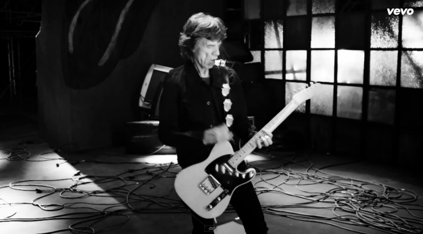
Here, Keith Richards is seen playing the guitar in what appears to be a dilapidated warehouse; the rolling stones tongue-and-lips logo is just visible in the corner, which appears to be spray painted on.

Even though Noomi Rapace is topless in this part of the music video, she is portrayed in a non-sexual way. Whilst dancing around in the rubbish, she is not seen to be looking at the camera to reinforce the voyeuristic nature of music videos. It's more of a display of openness and vulnerability: All that she has is rubbish.

In this deep three shot of the band, more of the members are on display in a disconnected manner: as there are not close-up, there is a voyeuristic nature to how the band are portrayed; perhaps the monochrome colour scheme is a sign of honesty and frankness.

The clips of the explosions is layered over with a digital-style plug in to make the viewers feel disconnected to the violence: it's as if they're watching another new broadcast, so won't take this as seriously as they should. I like how simple this effect is, and the texture it adds to the video.

The muse is seen now in a more sexualised fashion: such is evident due to the high angle shot of her rolling around in lingerie whilst wearing lingerie. Her red lips also connotes lust and danger. A trophy woman is often seen in rap and rock music videos, but this also may be a comment on Western values and capitalism, how sex and money is all that's really important to us.

A clip of a stock market graph being smashed apart cuts up the action: the colours are clear and vivid, and are no doubt a reference to the recession. Again, the blue-and-red overlaid makes the clip appear digital or 3D; not real, but recorded.

Text appears over an action sequence of tanks crawling about in night vision: the lyrics then appear on screen as though painted on. I would like to replicate this effect; it also reminds me of MCR's Na Na Na lyric music video.

The muse is now seen performing alongside the band, replicating Mick Jaggers's moves. As she does, the real Jagger keeps appearing in separate clips, making it appear as though Noomi Rapace and the Rolling Stone are turning into one another, or are the same person.

Later, we see the woman portraying an oil tycoon. Nothing sexual can be made of this, not with those mutton chops - and although she is not wearing anything under than blazer, her pantomime-performance of masculinity seems to be a piss-take of wealthy western men.


From this music video, I have gathered the basics of what I want to include in my music video: Special effects which give the illusion that the music video is filmed on a TV, performance from puppets and maybe one story line that will be acted out by the other puppet. Puppet is fun to say.

Tuesday, October 14, 2014

Instruments

today, the miniature drumkit has arrived for my puppet band
along with the drumsticks. in order for my puppet being able to hold said drumsticks, they have to be tied to his hands with bobbles
strapping plastic sticks onto an inanimate creature was not my proudest of moments

Monday, October 13, 2014

Wake up and Smell the Thrash | TRASH OR DIE

Thrash or die is a heavy metal band with a very small online presence. They enjoy subverting and complimenting their genre in a comedic fashion with their variety of odd music videos and amusing lyrics that can only be deciphered through the screams with the help of lyrics websites.


Thought beats: The music is loud and aggressive, and reminiscent, well, most songs under the thrash metal genre. The lyrics are narrative of somebody's everyday like, but are executed in an aggressive manner. The result is almost comedic.
Matching visuals to song: The puppet versions of the band are seen to be literally acting out the lyrics of the songs as well as performing as a miniature band. I really enjoy the concept of the puppets performing with instruments and may steal this idea
Star Image: The stars are depicted as puppets. Apart from that, none of the band members are actually featured on the music video


Friday, October 10, 2014

CD 1

Whilst taking photographs in my garden, I came across a rusty saw on one of the workbenches, and decided to take a close up shot to blade due to the interesting texture of the rust, and how it contrasted with the bleached wood.
Later on GIMP (a budget version of photoshop), I altered the desaturation so that the picutre was black and white, and then increased the contrast between the colours with the curve tool.
Due to the fact that my band's name is Macro Friends, I played the letter 'M' over the letter 'F' to create the band logo, and also act as a simple cover title for the band's first, self titled album.

Please note that this is not my final digipak cover, but it shall be featured on my website.

Marilyn Manson | Lest We Forget

Genre: Industrial Metal
Visuals: All of the album artwork has been created by the singer: Marilyn Manson. The front cover depicts the lead singer with a pair of wonky horns, accomplished with water colour paints. The image looks washed out and dirty.
The back cover is comparably cleaner with a plain black background, which the artists stands against due to the monochrome-white features and carefully constructed makeup: He looks like a woman from a film noire picture.
The inside book cover contains lyrics and credits, but the main picture of the artist which has been torn in two down the middle of his face, showing maybe some division or dysfunction is the artist's life or album; a broken man.
On the CD is a pinwheel made out of women's legs, wearing heels. It give the cover a sexual edge and objectifies parts of women's bodies. However it could also be argued that the repeated image of Manson's face is equal objectification, as he is a product which his fans would like to purchase.
Font: The font, for want of a better word, is gothic with lots of points and fairytale-esque flourishes. Some of the writing is bright red on a black background which ties in with the rock genre and is easily seen due to the bright contrast.

Thursday, October 9, 2014

Band Merch

Whilst exploring online, I found a T shirt making website named customink and had a go at making different T Shirts of my website and eventually, my band.


Reservior Dogs

Although I have not yet finished my story board, I now have a clear idea as to what I want as my opening after speaking with my media group in a brainstorming sessions. An idea I like was offered up by Mr Wallis about the walking scene in Reservoir Dogs. I will try to replicate this...but with puppets.

digipak idea

Whilst doodling, I came up with the idea of creating posters of the band as well as album covers.
Said band would be in a line-up holding objects or wearing their masks.

I additionally had the idea of experimenting with photographing my artists interacting with talcum powder after this video that I found whilst looking for lighting tips in the photography studio:


Wednesday, October 8, 2014

Kasabian | Velociraptor

Genre: Alternative Rock
Visuals: The front cover consists of four drawings of the same man, overlayed in a way that makes them create a spinning top shape in the centre of the image; inside is the band's name and the album title, which has been vertically transformed.
The band itself is upside down on the back cover, underneath the track listing. Below all of that are the credits and the barcode
Font: The font is uppercase and in boxy letters.

Fallout Boy | Save Rock and Roll

Genre: Pop Punk
Visuals: The front cover is an image of a couple of Asian boys holding hands: one wearing black and smoking; the other in a red shroud.
The back cover is letter box-red, witch a black block near the centre-top. On top of that is a red tracklist. At the bottom are the credits and a barcode.
The inside of the digipak bright red once more, and black paint drops can be seen dripping down.
Font: The font is uppercase and appears to be hand-written unsteadily.

Franz Ferdinand | You Could Have it So Much Better

Genre: Indie Rock
Visuals: The front cover of the CD shows a black and white-newsprint image of a woman calling out--overlaid is a green and red streak; on it are the contrasting colour which make up the title of the album "Franz Ferdinand".
The back cover has the tracklist aligned to the right, and the red-and-green streak can be seen in the corner, as though it has continued on from where the woman is singing (the red circle is just a sticker which is covering the bar code).
Inside images include pictures of the band in the same black and white style, shiny red holders for the CD and a sewn-in lyrics book which is in the style of a school notebook (there is even a small timetable on the very back page after the handwritten lyrics have stopped).
Font: A chunky version of the Arial font, as well as lowercase letters on the back cover which make up the track list. There is also a lot of handwritten content such as credits, the lyrics and other information.


Metallica | St Anger

Genre: Heavy Metal
Visuals: The front of the digipak depicts a red fist white is tied by grey rope, set on a sunbeam-background. The image is comic book-esque and not dissimilar to pop art. No text is seen on the front of the cover, if not for the 'Parental Advisory' warning, giving the album an element of 'edge'.
On the back of the digipak are the track lists, written in a horror-style font. There is an image of a red, grotesque face which has yellow puss seeping out of the gum line; the creature also has shaggy hair, probably much like most of its listeners.
The other two pictures are more variations of who must be the "St. Anger", of the album. No images of the band have been shown. There is only artwork.
Font: The main font is sans of detailing and very clean (as seen on the spine of the hardback-album. However, the track lists are written in a font that would not be out of place in the opening credits to a B movie.

My Chemical Romance | Three Cheers for Sweet Revenge

Genre: Rock
Visuals: The digipak's front cover is an illustration which has been done by the frontman Gerard Way, depicting a couple that are covered in blood or members of the undead--about to kiss. The simple colour scheme of black, white and read make what little colour there is, stand out against the bold background.
On the back cover, there is a picture of the band standing in a V formation with the front man standing at the front, and the drummer at the back - not dissimilar to how musicians usually position themselves during a performance.
Inside, the first page of the digipak have small square images of the band in a line-up, in the same white background. The main background is black, splattered with red.
The CD itself is white, with the image of a rosary dangling near the band name "My Chemical Romance".
Font: The main title looks as though it has been messily type-written, whereas the rest of the font throughout the main body of each page is Times New Roman: giving it an formal, traditional feel.

Friday, October 3, 2014

Editing

During the edit of the initial shoot, I found a useful tool for editing the vibrance of colour called 'Curve' on Adobe After Effects.
By manipulating the polar opposites of the curve line, blacks become balck and whites become white. Colours also become more vibrant.

New Set


The new filming date will be Saturday: 04/10/14 (6PM-8PM)
According to the weather forecast, most of that day will be rainy. However at 18:00PM, there will be sunshine as it begins to set, meaning that the actors will be relatively warm whilst filming.

Wednesday, October 1, 2014

Backstage

With the aid of Nikki Renshaw who volunteered to be my glamorous assistant, Macro Friend's studio performances were caught on camera for you lovely viewers to see what happened behind the scenes. As well as helping me direct the actors, she handed them props and aided me in steadying the camera with a complex series of thick maths books and thin worksheets. God bless Nikki - and god bless her camera phone.