Friday, May 15, 2015

Sunday, January 11, 2015
What Have You Learned From Audience Feedback?
Transcript:
The point of audience feedback is to help you get a better understanding of what it is that will draw a potential customer to your product. My audience for punk rock in particular seemed to be young adults due to the fact that original 70s punks had either died out or became the sorts to wear argyle sweaters and wash their cars every Saturday. I also found that the audience was not predominantly male, but rather, 60/40. Therefore I had to tailor my products to both men and women, which is why genderless puppets were used as the singers as opposed to a person who may not identify with certain social groups. Viewers were then free to apply their own meaning and significance onto an inanimate object regardless of gender, age, race or social class. Not knowing or caring who your audience are/have to say would be like painting a picture of spaghetti for an alien with a stick of broccoli - in a manner of speaking.
The bad thing about making my products appeal to a wider audience is that I had to condense and deconstruct a lot of the fake-band’s fake-integrity. In the end, they became little more than a concept/virtual band like Hatsune Miku or The Gorillaz. I found that doing this also stints your creativity. It also took away from the clear-cutness of how I expected a punk rock band to look.
Colours, characters and comedy appealed to my target audience, as well as quite a few others that I interviewed and had no interest in Punk. So, in order to appeal to a broader range of people, I applied these findings into Macro Friends. The puppets and the band’s antics are the comedy, as well as their character. Each mask represents a different band member and help to make the music video semi-narrative. As for the web site, I drew influence from Korn’s as well as a popular indie band Chet Faker—each had simple artwork, which tied in with their upcoming albums.
My field research took place outside a Black Veil Brides concert queue, but some of the footage was destroyed in a beer-spillage. However, some audience could be salvaged. Also, I did some research at school in the sitting area after school with people waiting to be interviewed by their tutors. This passed the time and also helped me get a sense of my peer’s attitudes to the rock genre – and how I may tailor my product to appeal to them. A great majority expressed a disliking or had very little knowledge about Punk. Thus, I had to alter my genre to punk rock (popular with males) crossed with pop-punk (popular with females).
In short, I found that I had to strip away a great deal of Punk’s integral features in order to sell Macro Friends as a product as opposed to them being talented, actual proper artists. I got rid of grungey outfits, mohawks and newspaper-hostage fonts and instead used skin textures and minimalism (black and white) which is commonly seen with techno artists such as MassiveAttack and Nine Inch Nails. I was also influenced by a the photographer Patrick Burdenz, who took picture inside a mortuary--by referencing him, I've referenced and redeveloped the idea of 'decay' and 'anarchy': A common feature in the punk genre.
In summation, audience feedback taught me that sticking to genre is not always a good thing, that time and effort can stop viewer's faces looking so sour whilst viewing my music video and to always accept constructive criticism whilst created a product for them; for money as well if I truly [and unfortunately] did work in the music industry.
Friday, January 9, 2015
In What Ways Does Your Main Product Use, Develop Or Challenge Forms And Conventions Of Real Media Products?
( If the embed code is not working, click here to see my reply to the answer )

I HAVE USED
Black and yellow colour schemes, as seen on the Never Mind the Bollocks album by the Sex Pistols for my website, CD and part of my music video where lyrics flash onscreen.

I HAVE DEVELOPED
I have developed the 'Mask' aesthetic of My Chemcial Romance's Na Na Na video via merchandise on my wedsite representing three masks, which is a reference to the personnas of the band members who cover their faces with paper mache masks in the music video.

I HAVE CHALLENGED the conventions of a punk video by introducing puppet characters as opposed to actual artists. The background for the shed filming was also more similar to Die Antwoord as opposed to Joy Divison or Dead Kennedys
How effective is the combination of your main product and ancillary texts?
( if the embed isn't working, click here to watch the presentation )
Thursday, January 8, 2015
Evaluation: How Did You Use New Media Technologies In The Construction And Research, Planning & Evaluation Stages
(click here to read the answer)
CONSTRUCTION
 Although not part of the New Media, Adobe Premier Pro was very useful in the construction of my final piece due to the fact that it allowed me to make creative decisions that aren’t available on other means of digital editing such as with linear software (Windows Movie Maker) – and as such, influenced my final project which would be distributed onto platforms such as youtube, blogger and facebook. I found that that the ability to add multiple layers onto the project helped me organise the clips. For example, after putting the music onto my project, I could then match up the lip syncing of my clips – and do so on multiple layers. After that, I was able to cut out dodgier parts of each clip such as the characters switching places or forgetting to lip sync. After that, I was able to select the clips I wanted and cut out the ones I didn’t need without having to worry about lip syncing (although using puppets helped in this area, as all they did was move their mouths up and down; thus more usable footage was at my disposal).

In retrospect, Premier pro had a variety of editing options such as changing the colour of the clip and sharpening it, but I didn’t use the technology to its full potential due to the fact that I did not know how to properly colour grade images without the help of tutorials during my AS film opening remake. However I learned a lot about Adobe After Effects after watching a tutorial about creating an RGB Split/Glitch effect. The software was hard to comprehend and it required me to keep referring back to the youtube tutorial, but I used it create the ending sting of the band logo. It was actually one of the very few parts of the music video that I was proud of. Youtube was therefore and essential tool from the New Media range now at our disposal through the internet – as the site’s premier pro and after effects tutorials taught me how to add exponential fades into my project (and example can be seen near the very end) and ghosting, which meant that one clip could be seen overlain through the other; vaguely similar to the True Detective opening credit that I looked at during my research stages. Early on during the creation of my digipak, I tried to use Photoshop in order to create each panel but learned very early on that I wasn’t experienced enough with the programme to create something good.

Therefore, I used GIMP and sites online called ONLINE IMAGE EDITOR and BAR CODE GENERATOR in order to overlay images when my computer was in for repair (online image editor) and make realistic packaging for the back panel of my digipak (The bar code). The parental advisory warning sticker was something I found on the image hosting website called Flickr, a very useful new media technology. However, the inability to save images from the site prove annoying, I had to screencap the stick so as to put it onto the product.

For the creation of my website, I used Wix due to the fact that it was user friendly and I was able to go back to my work to edit before I published – whenever I so desired. Initially, I drew inspiration from other band websites (Korn, Chet Faker, The Sex Pistols) and tumblr HTML layouts available on http://theme-hunter.tumblr.com/. Chet Faker’s minimalist design, Korn’s album cover background and The Sex Pistol’s bold fonts in turn inspired my final website, and thus the usefulness of the Google search engine is evident because without a browser, look for website inspiration would have been impossible.
 Wix was also very comprehensive and allowed me to make achievable decisions over the look of my final site; the option to edit picture using wix software before adding them onto the site (Namely, the black and white images of band members) was also a useful tool which help me accomplish the overall look of the blog (which was the overall look of the album and music video as well as).
The big three were used during the research process. Well, my big three. Tumblr, youtube and Vimeo. I used vimeo to look up the music videos for Royal Blood’s figure it out music video. The video hosting website catered more to independent film makers and as such displayed music videos in widescreen and gave the option to open the video in a popup window. However, youtube gave the option to adjust the resolution of videos whilst researching my selected genre (punk) and most ‘related videos’ were immediately at my disposal down the side of the page for a music video. This made researching my genre quicker to accomplish as opposed to in the past where one could only watch music videos on television channels such as MTV and Kerrang!
 Tumblr was a great help during the research process due to the search options. If I typed in a key word such as ‘punk’ or ‘grunge’ it wouldn’t just search for music videos, but also fashion blogs, fan-made graphics for tumblr user’s favourite bands and fashion as well as overall opinions of the genre from my intended audiences: young adults.
PLANNING
During the planning stages, I used Amazon to buy paint for the construction, papers masks, and a miniature drum kit. The latter didn’t make it into the re-shot as I eventually lost interest in the project due to personal issues (sorry!) but the immediacy of ordering products online was very using during the process of constructing my music video.

EVALUATION
For the evaluation, I used new media sites such as blogger to show you said evaluation (through either words or hyperlinks) and prezi, which made my answer to how effective the combination of my ancillary and main product was more comprehensible. Again, I like how simple the website is to use. Slideshare win again in user-friendliness, as being able to upload powerpoints from your computer to online was really useful in sharing my progress. However, it could take quite a while to load and the embed codes were temperamental when I hadn’t updated my flash. That goes for prezi, too. Although new media programmes were useful in the planning, construction and evaluation of my media product, technology can be unreliable and sometimes I found that doing things on paper before beginning the editing/research better helped me put my thoughts in order.
CONSTRUCTION


In retrospect, Premier pro had a variety of editing options such as changing the colour of the clip and sharpening it, but I didn’t use the technology to its full potential due to the fact that I did not know how to properly colour grade images without the help of tutorials during my AS film opening remake. However I learned a lot about Adobe After Effects after watching a tutorial about creating an RGB Split/Glitch effect. The software was hard to comprehend and it required me to keep referring back to the youtube tutorial, but I used it create the ending sting of the band logo. It was actually one of the very few parts of the music video that I was proud of. Youtube was therefore and essential tool from the New Media range now at our disposal through the internet – as the site’s premier pro and after effects tutorials taught me how to add exponential fades into my project (and example can be seen near the very end) and ghosting, which meant that one clip could be seen overlain through the other; vaguely similar to the True Detective opening credit that I looked at during my research stages. Early on during the creation of my digipak, I tried to use Photoshop in order to create each panel but learned very early on that I wasn’t experienced enough with the programme to create something good.

Therefore, I used GIMP and sites online called ONLINE IMAGE EDITOR and BAR CODE GENERATOR in order to overlay images when my computer was in for repair (online image editor) and make realistic packaging for the back panel of my digipak (The bar code). The parental advisory warning sticker was something I found on the image hosting website called Flickr, a very useful new media technology. However, the inability to save images from the site prove annoying, I had to screencap the stick so as to put it onto the product.

For the creation of my website, I used Wix due to the fact that it was user friendly and I was able to go back to my work to edit before I published – whenever I so desired. Initially, I drew inspiration from other band websites (Korn, Chet Faker, The Sex Pistols) and tumblr HTML layouts available on http://theme-hunter.tumblr.com/. Chet Faker’s minimalist design, Korn’s album cover background and The Sex Pistol’s bold fonts in turn inspired my final website, and thus the usefulness of the Google search engine is evident because without a browser, look for website inspiration would have been impossible.

The big three were used during the research process. Well, my big three. Tumblr, youtube and Vimeo. I used vimeo to look up the music videos for Royal Blood’s figure it out music video. The video hosting website catered more to independent film makers and as such displayed music videos in widescreen and gave the option to open the video in a popup window. However, youtube gave the option to adjust the resolution of videos whilst researching my selected genre (punk) and most ‘related videos’ were immediately at my disposal down the side of the page for a music video. This made researching my genre quicker to accomplish as opposed to in the past where one could only watch music videos on television channels such as MTV and Kerrang!

PLANNING
During the planning stages, I used Amazon to buy paint for the construction, papers masks, and a miniature drum kit. The latter didn’t make it into the re-shot as I eventually lost interest in the project due to personal issues (sorry!) but the immediacy of ordering products online was very using during the process of constructing my music video.

EVALUATION
For the evaluation, I used new media sites such as blogger to show you said evaluation (through either words or hyperlinks) and prezi, which made my answer to how effective the combination of my ancillary and main product was more comprehensible. Again, I like how simple the website is to use. Slideshare win again in user-friendliness, as being able to upload powerpoints from your computer to online was really useful in sharing my progress. However, it could take quite a while to load and the embed codes were temperamental when I hadn’t updated my flash. That goes for prezi, too. Although new media programmes were useful in the planning, construction and evaluation of my media product, technology can be unreliable and sometimes I found that doing things on paper before beginning the editing/research better helped me put my thoughts in order.
Friday, January 2, 2015


Thursday, December 11, 2014
MACRO FRIENDS
NON ADDITIVE DESOLVE
BLACK AND WHITE

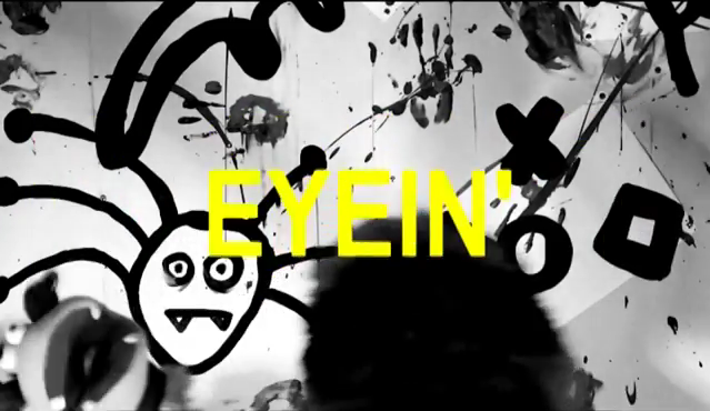
YELLOW ARIAL FONT CAPS


I used the non-additive dissolve near the opening sequence in order to give the illusion that the band/actors are jumping out of one another. A similar effect is also used in the System of the Down video Chop Suey, as well as Around the World by Red Hot Chilli Peppers, who also tie into the rock genre which Macro Friends sits itself in.


BLACK AND WHITE
I changed the video to black and white so that there was some synergy with the digipak as well as the website. I wanted the album titles 'monochrome' to more like a mantra than a product: but the purpose of grey scaling the image is to do just that. To sell the product. I was also influenced by Die Antwoord's I Fink U Freeky music video.
YELLOW ARIAL FONT CAPS
Yellow against a black background is commonly known to be a high-impact colour scheme. Therefore, in order to have amore dramatic effect I overlayed lyrics on top of the clips to draw attention away from some of the messier camera cuts, and to also entertain the audience. They learn the lyrics as well as the get a taste of what the band is about. I got this idea from My Chemical Romance's lyric video of Na Na Na.
Wednesday, December 10, 2014
RGB Split Glitch Logo
In the Rolling Stones video mentioned previously as well as several interesting graphic designs on the website tumblr is a special effect that I wanted to use whilst making my video. On GIMP I have more or less got to grips with how to accomplish the 'glitch effect' with the use of layers, but the process of making a moving image appear to be malfunctioning proved to be much more difficult. However, using a youtube tutorial, I managed to great an RGB split effect with my band's MF logo.
Another free resource I used was a downloadable sound effect from soundcloud, which added to the illusion of the glitching-out logo of the band. This effect is probably most commonly used in techno and electro music ( the tutorial itself includes a dubstep-sting along with the logo) but I think that it works well with the genre of pop-punk due to the fact that it accentuates the point that Macro Friends are part of a subversive genre. Their aim is to 'hack the system' *general socialist student mumbles* and more or less invade the mainstream.
The finished result is less impressive that that show in the tutorial, but as far as first attempts go, I think it's do just fine for an opening or closing clips for the music video in order to establish the band's brand from the get-go.
Another free resource I used was a downloadable sound effect from soundcloud, which added to the illusion of the glitching-out logo of the band. This effect is probably most commonly used in techno and electro music ( the tutorial itself includes a dubstep-sting along with the logo) but I think that it works well with the genre of pop-punk due to the fact that it accentuates the point that Macro Friends are part of a subversive genre. Their aim is to 'hack the system' *general socialist student mumbles* and more or less invade the mainstream.
The finished result is less impressive that that show in the tutorial, but as far as first attempts go, I think it's do just fine for an opening or closing clips for the music video in order to establish the band's brand from the get-go.
Friday, December 5, 2014
CD FIN
OUTSIDE

INSIDE

FRONT COVER
The eye is immediately drawn to the 'parental advsory' sticker, the sign of any good album--well, good if you're a ten year old. Needless to say, it's in key with quite a few other rock CDs (Marilyn Manson, Metallica).
The front cover is more simplistic than most punk rock albums in order to set Macro Friends apart from them. However, the black text on a square white back ground is a bit of a reference to the ransom note fonts (letters that have been cut out of a magazine and stuck with other oddly coloured letters to make words and sentences).

SPINE
The spine was kept quite simple, but the black background connotes a darker style of music and more likely to attract my target audience. Also, the yellow ARIAL text complements the lyrics of the music video as well as the website.
BACK COVER
The back cover of the digipak consists of a 'skin' background (black and white); on top of it is the image of a clenched fist with the colour inverted. The grey, Arial text contrasts the black background of the square. It's "Monochrome". In the bottom-left corner is the 'all rights reserved' text commonly seen one the backs of digipaks, along with mention of ANNA-KEY RECORDS. To further the level of authenticity, I have also added a bar code.
INSIDE - LEFT
This page was done pretty simply. I colorised the image of my cigarettes yellow and used the red option of the filter packs to make it look like a hotter shade of yellow and less washed out by black. On top of that is a white square: another reference to David Bowie.
INSIDE RIGHT
This is identical to the left panel, save for me brightening the image to represent the plastic case which holds the CD.
CD
The CD itself is plain white and there are square images of the puppet's different furs as a reference to the 'wanna do' music video.
OVERALL
I have not made a spine for the digipak because I wanted to make a digipak that looked a little bit like a vinyl sleeve: similar to Joy Division's debut EP An Ideal for Living. The cover is a black and white image of a Hitler Youth drumming.

DIGIPAK - CD STICKER

In order to make the inner CD sticker, I decided to collect the masks back from my actors (who'd taken them home with them after the shoot) and arrange them in a pattern before taking the photo.

First of all, I used the cutting tool to select the main area of the mask. After that I deleted the background so that I had one shape to work with, that could easily be added to another image once I was done.

Using the path tool again, I feathered the selection and made a line around the black areas of the mask. Once they were selected, I used the desaturate' tool in order to get rid of any excess RGB to make the part purely black and white.

Inverting the selection, I used the 'colorify' tool and selected the green field.

I repeated these steps until I got this. The CD background will be plain white to keep in line with the main colour scheme with the album, and the digipak background will be plain black again.
DIGIPAK - BACK

Inverting the photograph of my hand (painted white), I then overlayed some vaguely punk-sounding song titles onto the top of the image. These song titles were made with the help of a drunken brainstorm at the weekend with a few friends. The initial song is the unknown track that I chose. The font style is 'Sans'.

Using the square tool to wrap around the text, I then inverted the selection and filled it white. I was initially going to mimick David Bowie's The Next Day album by having a white square on top of the image with text on top, but thought I might have a go at reversing that look to further draw attention to the fact that Macro Friends are a subversive band who like to parody more professional acts.

In order to include technical stuff, I used a smaller font and set the alignment to 'fill', turning the font black to contrast against the white background. Anna-Key Records, fake guest performers, my name and my band's name are included.

In the end I also used another image from my white-paint dabbling for the background image, and instead of using a bar code, I thought of my band having more of an online presence, so created this bar code on Barcode Generator so that it their fans can actually scan the digipak for the music/gifts after buying the artwork, so that they may also purchase copies on Itunes for free.
Wednesday, December 3, 2014
Tuesday, December 2, 2014
DIGIPAK - front cover

First of all, I started with the picture of my face paint, desaturated it and then inverted the colour - giving it a bit of a 'minimalist' look which will tie in nicely with my pop band, wrapped in a punk band, wrapped in an art pop band, who are also virtual.
( Honestly there are too many genres which my unknown song can fit into, and so many that now physically and theoretically exist. )

I then wrote the title in bold ARIAL lettering, adding a space between each letter. I then inverted one half of the text and changed its background to white. Changing the 'colour to alpha' to black, the black letters became transparent, showing off the textured background.

Et voila! -- this cover also suits the website nicely.


More to panels soon to come.
Monday, December 1, 2014
Re-filming
After a brief spell of editing in order to refresh my braintatorimagination, I've found that although the content of my music video is odd enough to attract a viewer, the video needs more content.
As specified in the music video brief, my final piece must at least include:
This rough draft is definitely recognisable as a media student's work: haphazardly put together with minimal edits taking place.
This is great for authenticity due to the fact that Macro Friends is an up-and-coming punk band, but leaving as it is will not get me marks.
Additional plot brain storm:
- A variety of camera angles
- A show of editing skills
- Sufficient lip-syncing
- Shows the conventions of its genre
This rough draft is definitely recognisable as a media student's work: haphazardly put together with minimal edits taking place.
- Café/Cantina/Public place with the bands drinking coffee with the puppets afterwards
- Change the ending: Puppets were on TV and the band were watching them, crowded around a TV, then peel away their masks. (over shoulder shots, pan/tilt shots of house, close-ups,-mid-shots, low angle)
- Kid painting a picture of Macro Friends ( close ups on scribbling, child's insane expressions, his dishevelled house, etc.) -- but where do I get a kid???
- DEFINITELY a different location--either outdoors or somewhere more mundane. sunrise? sunset? night sky( torches needed to create sufficient lighting)?
Wednesday, November 26, 2014
Wix Tinkering

Unlike a conventional Punk website, I have instead decided to opt for a minimalist look: A plain-ish background with a simple black and white colour scheme, with the addition of yellow to make the navigation pages stand out. As you may have noticed, the record complany "Anna-Key" is a combination of my middle name and "key" as in music--the pun sounds a lot like "Anarchy": Puns are important...for comedy value and a reference to Macro friends' genre. The title is white, atop a black background. I did this in order to make it look like the name was taped onto the website in a rustic fashion, like a post on a prick wall.
I am not entirely happy with the pictures of the band and may replace them with the cover of the band's new album or the music video at a later date.
Also for the background, I have recently see this picture of mexican masks hanging on the wall and would like to do the same with my band masks--perhaps in a strip on the right hand side.


On this page, I have yet to change the about second. perhaps one day something witty we be in the place of the Wix default text.

The Merchandise page will display a large number of products, all at ridiculous prices: Pretty commonplace on your average rock website. How else are you going to stick it to the man without official merchandise from a manufactured punk band?

The gallery pictures need to be added to: i would like to perform another photoshoot and also take some pictures of stage venues and fake gigs.

The social links to twitter, blogger and 8tracks are all actual links, but ones that I have yet to make. Also on the bottom bar are tour dates and the address of Anna-Key Studios
Monday, November 24, 2014
Sub Pop Records WIP
Sub Pop is a record label founded in the '80s by Bruce Pavitt and Jonathan Poneman in Seattle, Washington. It was the first record label to sign Nirvana, Soundgarden and Mudhoney. Many and most bands on the music scene from the late eighties to early nineties on the Seattle music scene. They're well known to be one of the fair few to popularize the grunge genre; they still grasp onto critical and commercial success: modern bands including Fleet Foxes, Foals, Flight of the Conchords, and The Shins. 49% stake of the label now belong to the Warner Music Group (one of the big six production companies). The label are famed for their blunt letters to aspiring artists who they decline signing to their label: notes open with "Dear Loser".
[IMAGE OF SUB POP RECORDS]
This record label earns millions annually: not exactly your average indie punk record label, but still the company keeps up this image.
With this in mind, I decided to make my record label a parody of Sup Pop records. The simple black and white logo is also pleasing to the eyes, and I shall try to incorporate this into my final logo for the website.
Jimmy Jazz Records WIP
Jimmy Jazz Records, an independent record label from Poland, release mostly punk rock, ska, psychobilly and hardcore music artists. zine Except for records Jimmy Jazz sells clothes and other merchandise for the bands that they promote.

The image of a man in a mohawk drinking whilst another man - bold - leans on the same lamp post. Punk, Ska, Reggae etc. are written around the circular image, and also around the name of the label 'Jimmy Jazz'. As far as logos go, this one is very complex--but it is clearly identifiable as a punk rock record label due to font information and imagery. Therefore, effective.
Tuesday, November 11, 2014
editing
Due to the fact that I've lost the motivation to film after so long of a hiatus, I have instead turned my focus to editing
Tuesday, November 4, 2014
Photography

Band photo at school, near the RAC building. The members are leaning on a skip, whereas Summer is sitting (due to the fact that she is short and the height differences of the band are ridiculous).

Second photo of the band at school, looking sideways (except for Dylan); background is a yellow brick wall. They all look to be moving, representing the energy of '|Macro Friends'' music.

Taking at school, outside the playgroup. 'High voltage' song could be a reference to their 'edgy' music.

Dud photo; Summer unfocused. Still, the messiness of the photo ties in with the rock genre.

Texture taken from the bumpy texture of my laptop touchpad.

Close up of my orange shirt.

Frosted glass of landing window: outside is a brick wall. 'Icy' look may look better colorised blue or desaturated.

Another image of frosted glass from a different perspective.

Bare brick wall of old kitchen. 'Beauty in decay' and very grungy, tying into the rock genre and its subversive reputation.

Another image of a more dilapidated part of my house. Orange bricks, yellow plaster and peeling wallpaper. I my used this image as a semi-transparent overlay.

Bare brick wall and central window of my house's outside toilet. Messy paint and bare wires. The brick texture would be useful for an album cover or a web page.

Close up shot of a spider, suspended on its web alongside the murky, plastic window of my shed. Creepy and abstract; I like the colour scheme of brown and beige, and the contrasting patterns.

Wooden crates and old fences that will probably end up on our fire in the winter. They reminded me of the debris in the skip from the first image of the band, and are also reminiscent of urbanism and a junkyard; somewhere the band may perform or sing about.

A shot of the grassy floor with a fallen branch in the corner. Why not?

More firewood. I liked the different colours of the block and the blend that they had with one another.

The faded label of my dustbin. Red contrasting against grey; it also looked 'run down' and befitting punk.

A shot of the patio floor and the corner of our green house skeleton (the glass has been removed). Metal and concrete are typically associated with urban music and rock - as opposed to pop and electro, which have a cleaner, minimalist feel.

Treeline of our garden and a clear-ish sky (clear for Kirby at the very least)

Close up image of a dirty bird bath. The side of the water is only just visible in front of the red algae. I liked the colour - and the fact that it looks like the surface of an alien planet.

Close up of rotting lily pads and dead grass on top. More decay. I like this shade of vibrant green also.

Close up of a rusty saw on a wooden work bench. Reminiscent of Nine Inch Nails' album 'The Downward Spiral'.

Another close up of the saw: this time, of a whole in which the saw is usually hanged upon. Bit of a cobweb can also be seen.

A pretty picture of pretty flours with a red filter added on in the editing process of GIMP

Peeling paint on our shed door. Blue and black is a colour scheme that you don't usually see with punk bands: It's more for RnB and dance music.

Close up shot of hose brick work and cobwebs. More chipped paint and bare wood.

Image of the light bulb in our outside toilet. I really like the colour contract and the amount of light and focus I managed to get on the bulb.

Corner of the outside toilet: a popular hang out for spiders' webs and pubes. Also grimy and befitting the genre.

Cigarette tray in the outside toilet with boosted colour contract add after the editing process.

A shot condensation on my bedroom window: Could be useful for a texture overlay, or if the colours are inversed, a night sky.

Close up photograph of Summer, perhaps useful for an about page for the band.

Quite an intense shot of Danny scowling at the camera. Very befitting of the punk genre.

Dyal posing, high angle. Possibly useful for a propaganda-esque band poster.


Black and white version of the top images, inspired by the back image of Good Charlotte CD cover.

Subscribe to:
Posts (Atom)