Showing posts with label Editing. Show all posts

Thursday, December 11, 2014

MACRO FRIENDS

NON ADDITIVE DESOLVE
I used the non-additive dissolve near the opening sequence in order to give the illusion that the band/actors are jumping out of one another. A similar effect is also used in the System of the Down video Chop Suey, as well as Around the World by Red Hot Chilli Peppers, who also tie into the rock genre which Macro Friends sits itself in. 


BLACK AND WHITE
I changed the video to black and white so that there was some synergy with the digipak as well as the website. I wanted the album titles 'monochrome' to more like a mantra than a product: but the purpose of grey scaling the image is to do just that. To sell the product. I was also influenced by Die Antwoord's I Fink U Freeky music video. 


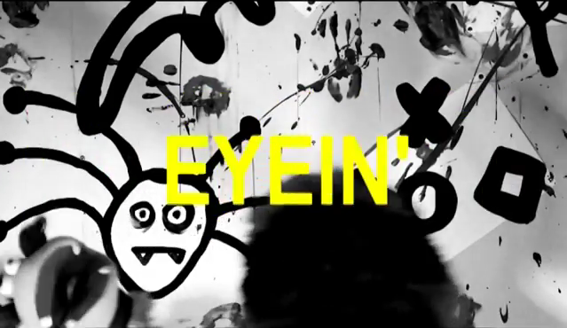
YELLOW ARIAL FONT CAPS
Yellow against a black background is commonly known to be a high-impact colour scheme. Therefore, in order to have amore dramatic effect I overlayed lyrics on top of the clips to draw attention away from some of the messier camera cuts, and to also entertain the audience. They learn the lyrics as well as the get a taste of what the band is about. I got this idea from My Chemical Romance's lyric video of Na Na Na.


Wednesday, December 10, 2014

RGB Split Glitch Logo

In the Rolling Stones video mentioned previously as well as several interesting graphic designs on the website tumblr is a special effect that I wanted to use whilst making my video. On GIMP I have more or less got to grips with how to accomplish the 'glitch effect' with the use of layers, but the process of making a moving image appear to be malfunctioning proved to be much more difficult. However, using a youtube tutorial, I managed to great an RGB split effect with my band's MF logo.


Another free resource I used was a downloadable sound effect from soundcloud, which added to the illusion of the glitching-out logo of the band. This effect is probably most commonly used in techno and electro music ( the tutorial itself includes a dubstep-sting along with the logo) but I think that it works well with the genre of pop-punk due to the fact that it accentuates the point that Macro Friends are part of a subversive genre. Their aim is to 'hack the system' *general socialist student mumbles* and more or less invade the mainstream.


The finished result is less impressive that that show in the tutorial, but as far as first attempts go, I think it's do just fine for an opening or closing clips for the music video in order to establish the band's brand from the get-go.


Friday, December 5, 2014

DIGIPAK - CD STICKER

In order to make the inner CD sticker, I decided to collect the masks back from my actors (who'd taken them home with them after the shoot) and arrange them in a pattern before taking the photo.

First of all, I used the cutting tool to select the main area of the mask. After that I deleted the background so that I had one shape to work with, that could easily be added to another image once I was done.

Using the path tool again, I feathered the selection and made a line around the black areas of the mask. Once they were selected, I used the desaturate' tool in order to get rid of any excess RGB to make the part purely black and white.

Inverting the selection, I used the 'colorify' tool and selected the green field. 

I repeated these steps until I got this. The CD background will be plain white to keep in line with the main colour scheme with the album, and the digipak background will be plain black again.

DIGIPAK - BACK


Inverting the photograph of my hand (painted white), I then overlayed some vaguely punk-sounding song titles onto the top of the image. These song titles were made with the help of a drunken brainstorm at the weekend with a few friends. The initial song is the unknown track that I chose. The font style is 'Sans'.

Using the square tool to wrap around the text, I then inverted the selection and filled it white. I was initially going to mimick David Bowie's The Next Day album by having a white square on top of the image with text on top, but thought I might have a go at reversing that look to further draw attention to the fact that Macro Friends are a subversive band who like to parody more professional acts.

In order to include technical stuff, I used a smaller font and set the alignment to 'fill', turning the font black to contrast against the white background. Anna-Key Records, fake guest performers, my name and my band's name are included.
In the end I also used another image from my white-paint dabbling for the background image, and instead of using a bar code, I thought of my band having more of an online presence, so created this bar code on Barcode Generator so that it their fans can actually scan the digipak for the music/gifts after buying the artwork, so that they may also purchase copies on Itunes for free.

Tuesday, December 2, 2014

DIGIPAK - front cover

First of all, I started with the picture of my face paint, desaturated it and then inverted the colour - giving it a bit of a 'minimalist' look which will tie in nicely with my pop band, wrapped in a punk band, wrapped in an art pop band, who are also virtual.
( Honestly there are too many genres which my unknown song can fit into, and so many that now physically and theoretically exist. )

I then wrote the title in bold ARIAL lettering, adding a space between each letter. I then inverted one half of the text and changed its background to white. Changing the 'colour to alpha' to black, the black letters became transparent, showing off the textured background.

Et voila! -- this cover also suits the website nicely.


More to panels soon to come.

Tuesday, November 11, 2014

editing

Due to the fact that I've lost the motivation to film after so long of a hiatus, I have instead turned my focus to editing