Tuesday, November 4, 2014

Freak Kitchen | Freak of the Week


The band are performing in a set location of what appears to be a studio. Black and lava-like interior. Lots of soft, low lighting. Their stage turns into a kicking bull.

Director/Artist: Juanjo Guarnido; ex-Disney artist and comic book illustrator, evident in the music video's cartoony aesthetic

Thought Beats: Music is a contrast to music video: Completely subversive of the animated music video genre. Instead of there being a narrative, the video is solely performance based.

Visuals to Lyrics: The visuals actually have nothing to do with the music video, save for the word freak perhaps tying in with the clip of freak shows. The song talks about the online community--specifically sites such as youtube and vine, where stupid people film themselves doing stupid things for online popularity. That being said, transforming the band into loveable cartoons is just as narcissistic as trying to skateboard.

Technical Aspects: Obviously, most of this has been achieve with editing software and flash. The cartoon animation is seamless. I'm in love and a little confused as to how Juanjo has managed to make a heavy metal band look like Disney princes.

Mise En Scene: Costumes are befitting the heavy metal genre, as is the dark and dingy set: Black and orange are the main components of the colour scheme.

Star Image: The performers seemed to have been transformed into cartoons. As well as this, circus-like posters are scattered about a wall showing members of the band, as though they are performers.

These cartoon versions of the band have inspired me to perhaps create a digipak or an about page on the web site in a similar style.

Monday, November 3, 2014

Patrik Budenz

(IMAGE: PLACEBO ONCE MOE WITH FEELING)
Patrik Budenz is a German photographer who chooses to capture a broad range of subjects, be they alive, dead, whole cities and even drag racers.
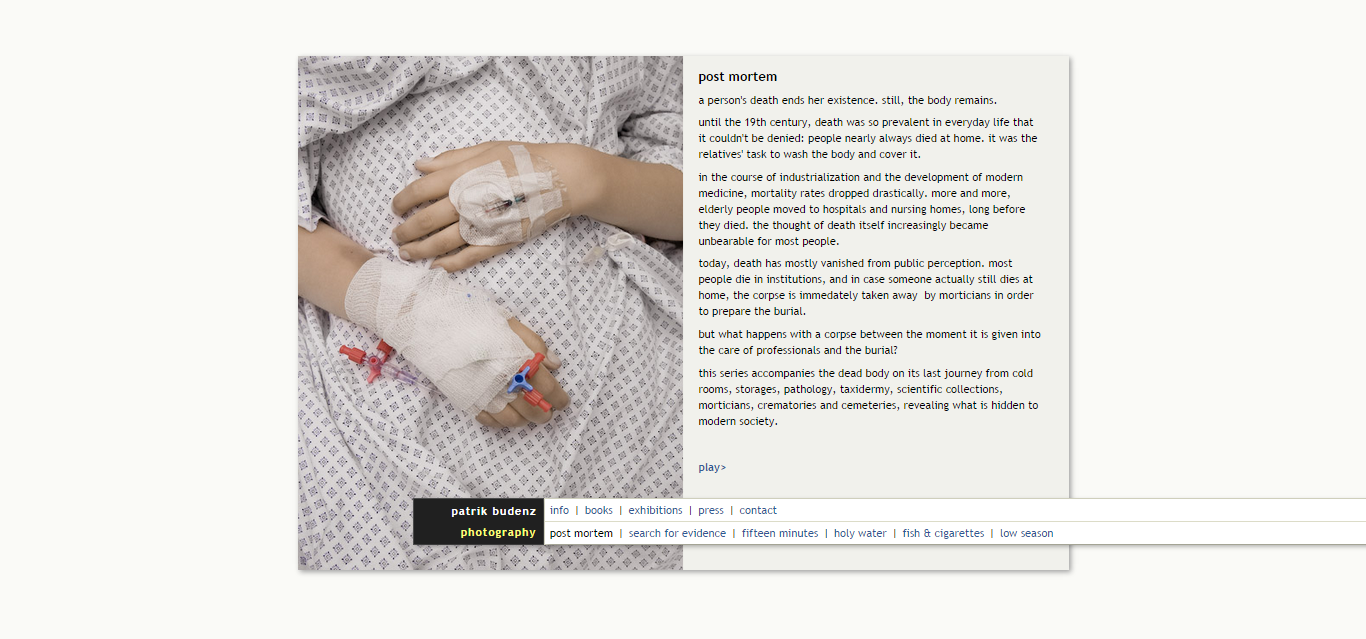
 Here is a picture of a deceased woman, pale and sickly apart from the vivid scar down her chest post!autopsy; there are also bruises and blotches, less in focus for savour of her smooth skin and pale lips This could be the comment on death that Patrik is talking about: In this day and age, nobody wants to think about the ugliness of death and would rather romanticise the life of this woman by only capturing her pale lips damp, porous skin.


Here is an image of the sallow skin of a dead man's foot: toe tag visible. The image almost needs to be double took due to the fact that the deceased's skin look more like a leather, or an object as opposed to an actual human being. The contract -and assimilation - of the metal table offers a reflection of the cadaver. Death seems to be sterile, clean and minimalist.


However in this photograph, we are reminded that dying isn't the prettiest, and neither is the embalming process. A pale hand is set beside a bloody background: the colour contrasts metaphorically showing how the life of this individual is being drained from him. Red connoting passion. I would like to replicate this with paint.


Inside the cremation chamber, Budenz has taken a picture of a skeleton which has recently been cremated--well, so recent that it's still being cremated. The intensity of the flames and the barely-visible bones lulls the viewer into a false sense of security due to the fact that one may think that this is just a typical autumn photograph of a warm and welcoming fire, when in fact a body is being destroyed. The vivid flames also ties into the energy that my song possesses: perhaps I could try to replicate this image by taking photographs of a fire (without a body, perhaps).


Only the top of someone's head can be seen in this image. In the foreground a lab coat can be seen on the peg-line of the lab, which makes this image neither morbid, shocking or minimalist. It's actually very clinical but also very warn due to the fact that there is a higher saturation of warm colours such as beiges and oranges, which was not seen in the prior images of the corpses.


For both my digipak case and my website, I decides to use aspects of what I had seen from these images: Skin, sterility and a human figure in order give my punk album a 'posh punk' style.

In order to do this, I covered different parts of my both with white paint t make myself appear deathly pale (and I had a butt load of poster paints left from making the band masks). After that, I fiddled with the focus of my camera to create odd macro compositions.


In this picture, I took an image of my risk for a 'clean convas sort of skin pattern which could be used as a basic background on a web page or a digipak tile.


After than I took a close up image of the side of my right eye, rolling it backwards to make it appear as though I had dead, milky lenses. I also made the camera focus on the eyelashes as opposed to the cheeks or the nose.


I then took a picture of the side of my neck, focusing the lens on the nape as opposed to any other part in order to give the image some depth of focus. It's not my most favourite self-portrait, simply due to the fact that my 'stache and rough skin are obscenely visible. Still, it's an interesting texture, and would work well for the enter page of my website.


After that, I took a low angle picture of my face, as though I were lying down, and made sure that my eyes were hollowly focused in one direction (which isn't that hard - I'm a day dreamer). The nose and the right cheek are the main focus as opposed to the eyes, which the audience should focus on as an afterthought due tot he nose being aligned with the rule of thirds.


Finally, here two pictures are of my hands: covered in blotchy bits of paint. In the top image, I tried to which move my hand in order to make the image less visible. However in the bottom one, I specifically tried to capture the rough pattern on the inside of my hand.


All of the images that I have taken will be manipulated on GIMP, to be used for the website and digipaks.


Wednesday, October 22, 2014

Planning


Storyboard

My initial storyboard would be similar to Imagine Dragons' Radioactive music video, wherein the narrative of the film is centred around a fight which ensues between two puppet creatures, surrounded by a crowd baying for blood in a cock fight set-up. However in my video, it would be one of the masked band members fighting with the puppet: Making the video silly, but also showing the band member to be lesser than or equal to a puppet after they lose the fight.
I scrapped this idea and focused on what I had, and what was possible: I had puppets, miniature instruments and access to a camera. Therefore, I wished to simplify the video into something similar to THRASH OR DIE's music video, wherein the puppet versions of the band are seen performing an lip syncing their song with plenty of quick cuts in between to keep things interesting. I have decided to scrap the narrative and make it solely performance based, as is seen with a majority of punk videos due to the fact that MVs cost money and are funded by the record labels, who may be seen as "The man" by the performing artists.

I also had the idea of redesigning the set and making it more politically fuelled, but settled on using the same set as I had used with my actors in the shed. After that, I re-listened to the lyrics of the song and drew what I thought would occur alongside the lyrics, which I will try to include if the puppet's performance gets too repetitive.

Last but not least is the finished (albeit, messy) storyboard: I have written nothing in the boxes and have visually drawn which camera angles I wished and was able to include--which is basically a variety of mid-shots and close-ups, with the puppeteer's hand cut out of the screen.
I also added a very small bit of narration: The puppets will be seen walking down a street and entering the 'set' before beginning to play.
The rest of the magic will occur in the editing process.


Friday, October 17, 2014

Wix #1

For making my band website, I discovered a site named Wix which allows its users to use their templates and URLs in order to create a customized website for their businesses/blogs/personal sites.
Initially, I found a blog layout that was in fact an 'Enter site' layout, which I thought would suffice for my own. The initial layout was for an indie CD, and if I complete my own digipak in time, it would be interesting to change this in a 'Macro friends' advertisement for their new album and song: as is seen with most of the other band sites that I have researched such as Queens of the Stone Age and Korn, wherein there is a page with a link to the main site as opposed to their just being one home page.


A blog layout which I also thought would be interesting to use was 'White Rabbit'. There are links to 'tour dates' which I can alter, as well as there being a gallery page and a video link which I can change into my music video once it's completed.


However, the home page I settled for was not a music website layout. In fact, it was a 'theatre' page. The links are minimal and simplistic - and the title which is over-layed on black strips over the clickable photographs remind me of the Sex Pistols album 'Never Mind the Bollocks'.
I am going to put loads of photographs of the band into the gallery, and also some CD covers as well as gig posters--all merchandise that can advertise my band.

Wednesday, October 15, 2014

Doom and Gloom | The Rolling Stones


Thought Beats: The drum beats offer a basic 1/4 time signature, as is common with the classic rock genre - but the guitars screech out in odd syncopations which aide in speeding up the tempo of the music, making for an energetic
Portrayal of Women: Although she is shown without her kit off, the directors have done it in a way that seems to be subversive to the sexualisation of female. There is no sensuality; when she is seen nude, she is either writhing in rubbish, hitching a ride or rolling around in money. She is not seen as a sex object--it's as though she's having a piss-take of 'those' sorts of videos, whereing the woman should always be the centre of male affection. This is not the case; she is also seen dressed as men and throwing up in a McDonalds. In theory, her scanty outfits and extroverted attitude should be sexual--but the cuts of the camera are too quick, and one cannot escape the topics that she is actually acting out such as consumerism and how western culture is a thow-away, ultra-pop, money-driven land of doom and gloom.
Visuals to song: As the band performs, their muse Noomi (as seen in the Kasabian music videos) performs in various locations, acting out controversial topics of Western culture such as her being an oil tycoon who causes pollution, and in one scene she is smashing up her house as a soldier.
Technical Aspects: There are a lot of sharp, quick cuts which help transition the clips during the music video to the beat of the fast paced music. There are also moments where the picture begins to develop static and warp, as though a TV channel is being changed on an analogue TV.
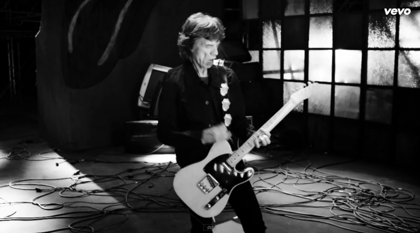
Here, Keith Richards is seen playing the guitar in what appears to be a dilapidated warehouse; the rolling stones tongue-and-lips logo is just visible in the corner, which appears to be spray painted on.

Even though Noomi Rapace is topless in this part of the music video, she is portrayed in a non-sexual way. Whilst dancing around in the rubbish, she is not seen to be looking at the camera to reinforce the voyeuristic nature of music videos. It's more of a display of openness and vulnerability: All that she has is rubbish.

In this deep three shot of the band, more of the members are on display in a disconnected manner: as there are not close-up, there is a voyeuristic nature to how the band are portrayed; perhaps the monochrome colour scheme is a sign of honesty and frankness.

The clips of the explosions is layered over with a digital-style plug in to make the viewers feel disconnected to the violence: it's as if they're watching another new broadcast, so won't take this as seriously as they should. I like how simple this effect is, and the texture it adds to the video.

The muse is seen now in a more sexualised fashion: such is evident due to the high angle shot of her rolling around in lingerie whilst wearing lingerie. Her red lips also connotes lust and danger. A trophy woman is often seen in rap and rock music videos, but this also may be a comment on Western values and capitalism, how sex and money is all that's really important to us.

A clip of a stock market graph being smashed apart cuts up the action: the colours are clear and vivid, and are no doubt a reference to the recession. Again, the blue-and-red overlaid makes the clip appear digital or 3D; not real, but recorded.

Text appears over an action sequence of tanks crawling about in night vision: the lyrics then appear on screen as though painted on. I would like to replicate this effect; it also reminds me of MCR's Na Na Na lyric music video.

The muse is now seen performing alongside the band, replicating Mick Jaggers's moves. As she does, the real Jagger keeps appearing in separate clips, making it appear as though Noomi Rapace and the Rolling Stone are turning into one another, or are the same person.

Later, we see the woman portraying an oil tycoon. Nothing sexual can be made of this, not with those mutton chops - and although she is not wearing anything under than blazer, her pantomime-performance of masculinity seems to be a piss-take of wealthy western men.


From this music video, I have gathered the basics of what I want to include in my music video: Special effects which give the illusion that the music video is filmed on a TV, performance from puppets and maybe one story line that will be acted out by the other puppet. Puppet is fun to say.

Tuesday, October 14, 2014

Instruments

today, the miniature drumkit has arrived for my puppet band
along with the drumsticks. in order for my puppet being able to hold said drumsticks, they have to be tied to his hands with bobbles
strapping plastic sticks onto an inanimate creature was not my proudest of moments